Chapter 7 Implementing the Preferred Model for the ACA
7.1 Exploring the Queensland Shapefile
Shapefiles are useful in spatial modelling for two reasons: they contain the spatial information necessary to determine the spatial dependencies (e.g. latitude and longitude of centroids, distances between centroids, adjacency (neighbours)), and they provide the fundamental layer in spatial visualisations. It is very easy to create thematic and other spatial maps using shapefiles in conjunction with the R package ggplot2.
There are plenty of shapefiles freely available for download from the Internet. The Queensland shapefile was created by modifying an Australia-wide shapefile obtained from the Australian Bureau of Statistics ( http://www.abs.gov.au/AUSSTATS/abs@.nsf/DetailsPage/1270.0.55.001July%202011?OpenDocument). The areas in this shapefile represent statistical areas level 2 (SA2s), ASGS 2021. Australia has 2454 SA2s (excluding SA2 codes with non-physical locations).
This shapefile can be downloaded as a zip file to a local directory on your computer, extracted, and then read into R. This process is streamlined using the following R code.
# Download, extract, and read shapefile
URL <- "https://www.abs.gov.au/statistics/standards/australian-statistical-geography-standard-asgs-edition-3/jul2021-jun2026/access-and-downloads/digital-boundary-files/SA2_2021_AUST_SHP_GDA2020.zip"
temp <- tempfile()
download.file(URL, temp)
file.rename(temp, paste0(temp, ".zip"))
temp <- paste0(temp, ".zip")
unzip(temp, exdir = tempdir())
map.Aus <- paste0(tempdir(), "/SA2_2021_AUST_GDA2020.shp") %>%
    st_read()
unlink(temp)
rm(temp)
Alternatively, the map can be read in using absmapsdata available from GitHub.
map.Aus <- strayr::read_absmap("sa22021") %>%
    rename(SA2_CODE21 = sa2_code_2021)   # Rename SA2 code field to match alternative method above
Note that the projections differ slightly between the two versions.
To create the Queensland map, we will make the following modifications
- Exclude areas outside of Queensland.
- Reduce the complexity of the polygon detail. This reduces plot rendering times (and file size if you choose to save the modified shapefile).
- Remove unnecessary spatial data from shapefile (SA3 and SA4 codes and names, square metres area, etc.)
- Add estimated residential population (ERP).
# Exclude areas outside of Queensland
map <- map.Aus %>%
    filter(STE_NAME21 == "Queensland")

# Remove empty polygons
map <- map %>%
    slice(-which(st_is_empty(map)))

# # Optional: simplify polygons (this may take up to several minutes)
# map <- ms_simplify(map, keep = 0.05)

# Remove unnecessary spatial data fields
names(map)
map <- map %>%
    select(SA2_CODE21, SA2_NAME21, geometry) %>%
    st_make_valid()    # Fixes 2 degenerate areas

# Download and read in estimated residential population data
temp <- tempfile()
download.file("https://www.abs.gov.au/statistics/people/population/regional-population/2022-23/32180DS0001_2022-23.xlsx", temp)
file.rename(temp, paste0(temp, ".xlsx"))
temp <- paste0(temp, ".xlsx")
ERP <- read_xlsx(temp, sheet = "Table 3", skip = 6) %>%
    select(`SA2 code`, `no....9`) %>%
    rename(pop = `no....9`) %>%
    mutate(across(c(`SA2 code`, pop), as.integer))

# Add records to sf map
map <- map %>%
    mutate(SA2_CODE21 = as.integer(SA2_CODE21)) %>%
    left_join(ERP, by = c("SA2_CODE21" = "SA2 code"))

N <- nrow(map)    # 546 areas
If you want to save the resulting sf object, use the following code:
where driver is "ESRI Shapefile" or "MapInfo File" for example.
For the ACA, SA2s which had no residential population or fewer than 5 residents on average per year during the study period 2010-2014 were excluded from the model (i.e. no estimates were provided for these areas). For illustration, we will also exclude these SA2s (the ones in Queensland) in this example scenario too. Note that we still want to keep these areas in the sf object for plotting purposes - we only exclude them from the model.
# Determine areas with no or small population
map <- map %>%
    mutate(exclude = ifelse(pop < 5, TRUE, FALSE))
Now let’s explore this (modified) shapefile. sf objects area easily visualised in R using ggplot with the geom_sf geometry.
# Quick plot
ggplot(data = map, aes(geometry = geometry)) +
    geom_sf(colour = "black", fill = NA, linewidth = 2) +  # Optional: adds a thick border
    geom_sf(colour = NA, aes(fill = pop))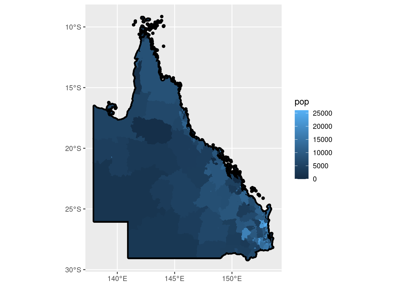
This is just a plot of the 546 Queensland SA2s coloured by the corresponding ERP value.
Now let’s map some spatial information encoded within the sf object to each of these areas.
# Compute matrix of distances between centroids
dist.matrix <- st_centroid(map) %>%
    st_distance(which = "Great Circle")
## Warning: st_centroid assumes attributes are constant over geometries# Compute distance from select area; add to sf map
# Use area "Roma" (SA2 code 307011176) for illustration
map <- map %>%
mutate(
dist = dist.matrix[which(map$SA2_NAME21 == "Roma"),],
dist = as.numeric(dist) / 1000 # Convert m to Km
)
# For clarity, truncate distances > 1000Km so these areas have the same colour
map <- map %>%
mutate(dist = ifelse(dist > 1000, 1000, dist))
# Define fill colours as hexidecimal values (change as desired)
Fill.colours <- c("white", "#00ffff", "#00bfff", "#0040ff", "#0000cc", "#000099")
Fill.values <- c(0, 100, 250, 500, 750, 1000)
# A better way to create a map border
map.border <- map %>%
select() %>% # Ignore everything except the geometry
summarise() # Dissolves the SA2 boundaries into one large region
# Plot the map
ggplot(data = map, aes(geometry = geometry)) +
geom_sf(data = map.border, colour = "black", fill = "grey30", linewidth = 0.8) + # QLD border
geom_sf(colour = NA, aes(fill = dist)) +
scale_fill_gradientn("Distance from Roma",
colours = Fill.colours,
values = rescale(Fill.values, from = range(Fill.values)),
breaks = Fill.values[-2],
labels = c(Fill.values[-c(2, 6)], "1000+"),
limits = range(Fill.values)
) +
theme_void() +
guides(fill = guide_colourbar(barwidth = 15, position = "bottom")) 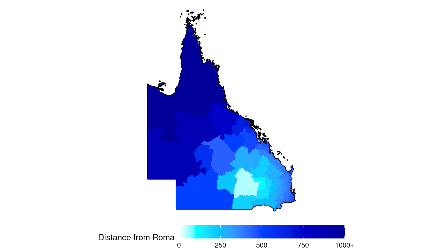
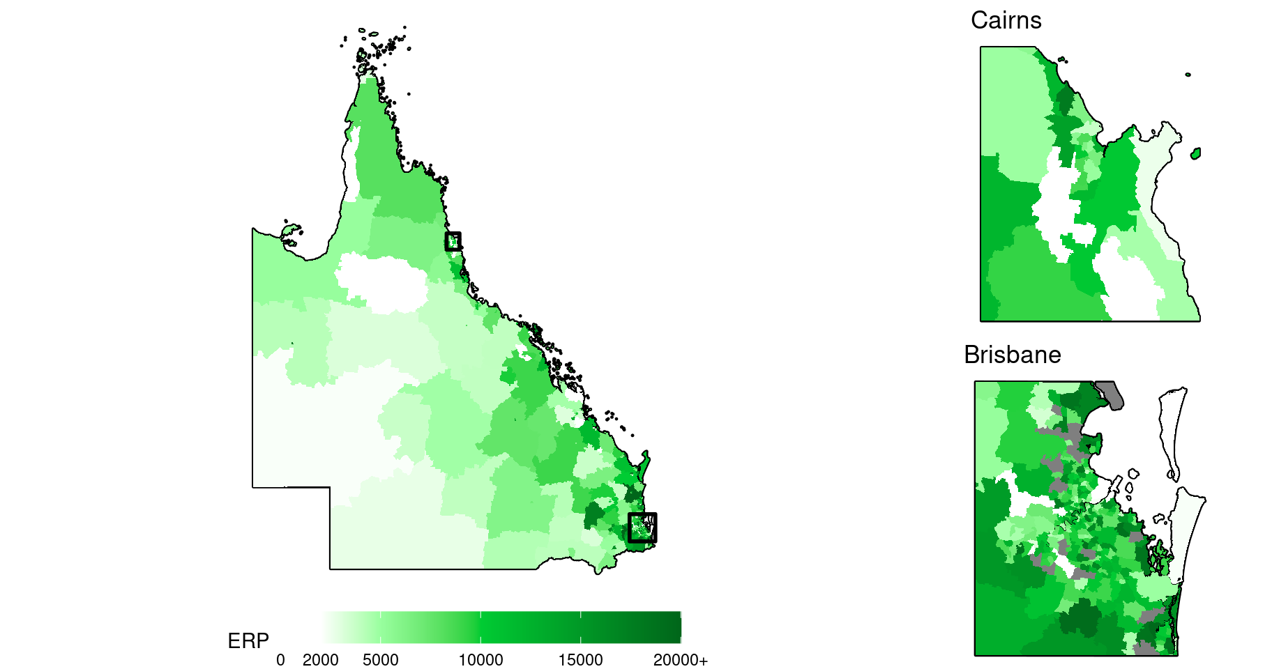
Map insets can be used to help visualise the spatial patterns in regions of small, tightly-clustered SA2s, which is typical around major cities. Here is another map of the ERP including two city insets, one for Brisbane, and one for Cairns.
# For clarity, truncate ERP > 20000Km so these areas have the same colour
Fill.colours <- c("white", "white", "#99ff9f", "#00cc33", "#009926", "#00661a")
Fill.values <- c(0, 2, 5, 10, 15, 20) * 1000

# Create map inset borders
make.sf.rect <- function(x, y, CRS){
    rect <- c(x[1], y[1], x[2], y[1], x[2], y[2], x[1], y[2], x[1], y[1]) %>%
        matrix(ncol = 2, byrow = TRUE) %>%
        as.data.frame() %>%
        st_as_sf(coords = c("V1", "V2"), crs = CRS, agr = "constant") %>%
        summarise(geometry = st_combine(geometry)) %>%
        st_cast("POLYGON")
    return(rect)
}

map.Brisbane.border <- make.sf.rect(x = c(152.6, 153.6), y = c(-28, -27), st_crs(map))
map.Cairns.border <- make.sf.rect(x = c(145.5, 146), y = c(-17.3, -16.7), st_crs(map))

# Common components of each map
gg.base <- ggplot(data = map %>% mutate(pop = ifelse(pop > 2e4L, 2e4L, pop)), aes(geometry = geometry)) +
    scale_fill_gradientn("ERP",
        colours = Fill.colours,
        values = rescale(Fill.values, from = range(Fill.values)),
        breaks = Fill.values,
        labels = c(Fill.values[-6], "20000+"),
        limits = range(Fill.values)
    ) +
    theme_void()

# Add visible layers for main plot
gg.QLD <- gg.base +
    geom_sf(data = map.border, colour = "black", fill = "grey30", linewidth = 0.8) +
    geom_sf(colour = NA, aes(fill = pop)) +
    geom_sf(data = map.Brisbane.border, colour = "black", fill = NA, linewidth = 1) +
    geom_sf(data = map.Cairns.border, colour = "black", fill = NA, linewidth = 1) +
    guides(fill = guide_colourbar(barwidth = 15, position = "bottom"))

# Map insets
gg.inset.Brisbane <- gg.base +
    geom_sf(data = map.border %>% st_intersection(map.Brisbane.border), colour = "black", fill = "grey30", linewidth = 0.8) +
    geom_sf(data = map %>% st_intersection(map.Brisbane.border), colour = NA, aes(fill = pop)) +
    guides(fill = "none") +
    ggtitle("Brisbane")

gg.inset.Cairns <- gg.base +
    geom_sf(data = map.border %>% st_intersection(map.Cairns.border), colour = "black", fill = "grey30", linewidth = 0.8) +
    geom_sf(data = map %>% st_intersection(map.Cairns.border), colour = NA, aes(fill = pop)) +
    guides(fill = "none") +
    ggtitle("Cairns")

# Render the plots
grid.arrange(
    gg.QLD,
    arrangeGrob(gg.inset.Cairns, gg.inset.Brisbane, ncol = 1),
    ncol = 2, widths = c(10, 4)
)
7.2 Exploring Simulated Incidence Data
Now let’s import and explore some simulated incidence data.
##   SA2_CODE21 covariate expected observed
## 1  301011001 0.0493789 80.20234       93
## 2  301011002 0.5978811 36.55507       32
## 3  301011003 0.7546082 73.82839       72
## 4  301011004 2.6566789 88.82619      112
## 5  301011005 0.8402011 18.74607       21
## 6  301011006 1.0370227 57.22283       56
# Combine with sf
map <- map %>%
left_join(sim.data, by = "SA2_CODE21")
# Compute the observed (raw) SIR
map <- map %>%
mutate(
SIR = observed / expected,
SIR = ifelse(is.nan(SIR), 0, SIR)
)
# Create a modified data set for plotting
dat <- map %>%
# Truncate raw SIR and observed values
mutate(
SIR = case_when(
SIR > 4 ~ 4,
SIR < 0.25 ~ 0.25,
TRUE ~ SIR
),
observed = ifelse(observed > 100, 100, observed)
)
# Fill colours for observed and SIR variables
Fill.colours.obs <- c(grey(seq(1, 0, -0.25)), grey(0.05))
Fill.colours.SIR <- c("#2C7BB6", "#2C7BB6", "#ABD9E9", "#FFFFBF", "#FDAE61", "#D7191C",
"#D7191C")
# Values corresponding to the fill colours
Fill.values.obs <- c(seq(0, 100, 25), max(map$observed)) # Solid black for obs > 100
Fill.values.SIR <- c(log2(0.25), seq(log2(1/2), log2(2), length = 5), log2(4))
# Note: we use logged values for the SIR so that the colour gradient is linear
# Common components of each map
gg.base <- ggplot(dat, aes(geometry = geometry)) +
guides(fill = guide_colourbar(barwidth = 15, position = "bottom")) +
theme_void()
# Add unique layers
gg.obs <- gg.base +
geom_sf(data = map.border, colour = "black", fill = "grey30", linewidth = 0.8) +
geom_sf(colour = NA, aes(fill = observed)) +
scale_fill_gradientn("",
colours = Fill.colours.obs,
values = rescale(Fill.values.obs, from = range(map$observed)),
limits = range(Fill.values.obs)
) +
ggtitle("Observed cases")
gg.SIR.raw <- gg.base +
geom_sf(data = map.border, colour = "black", fill = "grey30", linewidth = 0.8) +
geom_sf(colour = NA, aes(fill = log2(SIR))) +
geom_sf(data = map.Brisbane.border, colour = "black", fill = NA, linewidth = 1) + # For map inset
scale_fill_gradientn("",
colours = Fill.colours.SIR,
values = rescale(Fill.values.SIR, from = range(log2(dat$SIR))),
limits = range(log2(dat$SIR)),
breaks = seq(-2, 2),
labels = round(2^seq(-2, 2), 3)
) +
ggtitle("Observed SIR")
# Render the plots
grid.arrange(gg.obs, gg.SIR.raw, nrow = 1)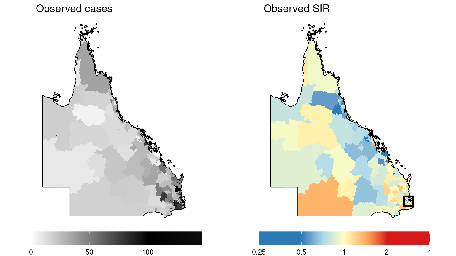
It is difficult to determine what patterns may exist in the more densely populated regions where SA2s are smaller. Here is a map inset for the observed SIR in the capital city, Brisbane.
# Restrict SIR data to Brisbane before plotting
dat <- dat %>%
    st_intersection(map.Brisbane.border)

# Map inset for Brisbane
gg.base +
    geom_sf(data = map.border %>% st_intersection(map.Brisbane.border), colour = "black", fill = "grey30", linewidth = 0.8) +
    geom_sf(data = dat, colour = NA, aes(fill = log2(SIR))) +
    scale_fill_gradientn("",
        colours = Fill.colours.SIR,
        values = rescale(Fill.values.SIR, from = range(log2(dat$SIR))),
        limits = range(log2(dat$SIR)),
        breaks = seq(-2, 2),
        labels = round(2^seq(-2, 2), 3)
    ) +
    guides(fill = "none") +
    ggtitle("Observed SIR (Brisbane)")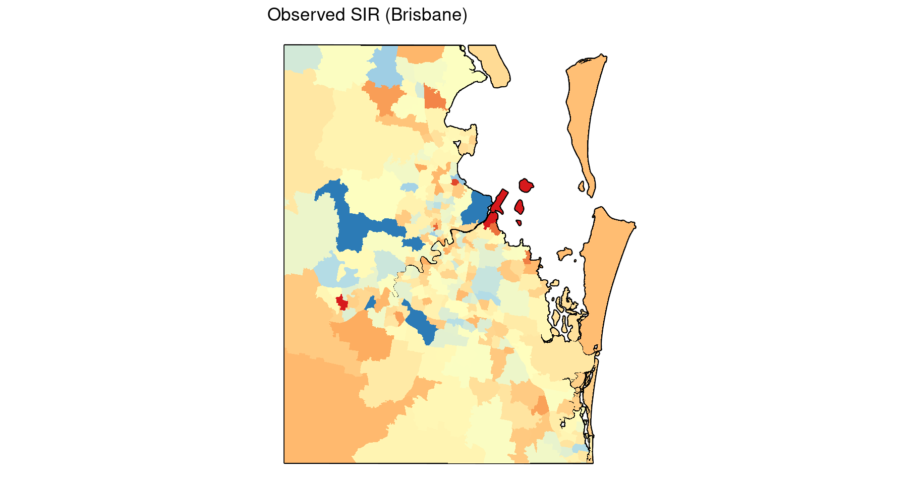
7.3 Fitting the Leroux model to the Incidence Data
Looking at the plots of the simulated incidence data above, there doesn’t appear to be very strong spatial patterns amongst the observed values or observed SIR values, although there does appear to be some degree of spatial dependence given that the observed SIR values are typically elevated in the southeast region (Brisbane) compared to the rest of Queensland. But spatial patterns in the data are often obscured by other variables such as covariates, the expected values which acts as an offset to account for population differences, and random variation (noise). Put another way, each of these variables can be thought of as a “layer” contributing to the relative risk surface and ultimately to the observed values. The layer which accounts for the spatial autocorrelation after accounting for each of the other layers should reveal a spatial pattern with some degree of smoothness (spatial autocorrelation). When we fit a spatial model to this data, the spatial smoothing parameter is estimating this layer. This layer can be thought of as the underlying spatial random field, and can be just as interesting as the relative risk surface. By fitting a Bayesian model, we should be able to estimate these individual layers comprising the relative risk surface.
Here we demonstrate how to fit the preferred incidence model from the ACA: the Leroux model (refer to Section 5.2.3). For this particular model, there are numerous software options that can be used to estimate the parameters. One of the easiest methods is using MCMC estimation in the CARBayes R package (Lee 2013).
Note that CARBayes requires a spatial weights matrix as an input into the model. We will use the binary, first-order, adjacency weights matrix again (refer to Sections 4.7 and 4.8).
# Create binary, first-order, adjacency spatial weights matrix
W <- st_touches(map) %>%
    as.matrix() * 1

# Summarise output
image(W)    # red = 0, yellow = 1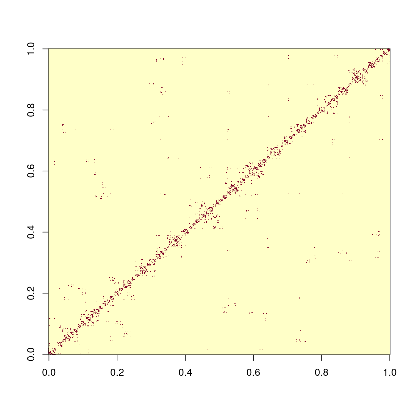
Unfortunately, there are some areas with no immediately adjacent neighbours. This creates a problem when trying to fit a spatial model. (If you run the second code chunk below now, CARBayes will encounter a run-time error as a result). There are two solutions:
- For the areas without neighbours, set the spatial smoothing parameter to zero, and only estimate it for the remaining areas.
- Construct artificial neighbours for these areas by linking them to one or more other areas. These links could be based on tangible connections like bridges, or less tangible connections like ferry and air transport terminals, or simply the nearest (non-adjacent) neighbour.
The second option is generally easier, and providing links are sensible, is arguably better since it provides some spatial smoothing for all areas. We will use the second option here by using the nearest neighbour approach.
Note also that the SA2s with an ERP < 5 which were marked for exclusion earlier need to be excluded from the spatial weights matrix as well.
# Which areas have no neighbours?
no.neighbours <- which(rowSums(W) == 0)

# Determine which areas are closest to these areas
nearest.area <- dist.matrix[,no.neighbours] %>%
    as_tibble() %>%
    mutate(
        across(everything(), as.numeric),
        across(everything(), ~ ifelse(.x < 1e-8, Inf, .x))  # Exclude self-neighbours
    ) %>%
    apply(2, which.min) %>%
    as.integer()

# Update the spatial weights matrix with these new links
W[cbind(no.neighbours, nearest.area)] <- 1
W[cbind(nearest.area, no.neighbours)] <- 1   # Keep W symmetric

# Exclude SA2s with ERP < 5
W <- W[-which(map$exclude), -which(map$exclude)]
Now we are ready to fit the model. Note that the simulated data includes a covariate. The reason for including a covariate may be to control for a known or suspected risk factor, so that residual spatial patterns can be estimated. In practice, this may be a socioeconomic variable, or a variable that delineates between urban and rural areas. An unadjusted model (i.e. without covariates) may also be of interest, but for the sake of illustration, we will include the simulated covariate here.
As aforementioned, CARBayes also includes a global intercept term by default, so the \(\mu_0\) term in the Leroux model is zero. Assuming some weakly informative priors, we will fit the following model:
\[Y_i \sim \mbox{Po}\left(E_i e^{\mu_i}\right)\]
where \(Y_i\) and \(E_i\) are the observed and expected counts for SA2 \(i\) respectively,
\[
\mu_i = \beta_0 + \beta_1 x_i + S_i \\
\beta_0 \sim \mathcal{N}(0, 100) \\
\beta_1 \sim \mathcal{N}(0, 100) \\
S_i \mid \bm{S}_{\smallsetminus i} \sim \mathcal{N}\left(\frac{\rho \sum_j{w_{ij}s_j}}{\rho \sum_j{w_{ij}}+1-\rho}, \frac{\sigma_s^2}{\rho \sum_j{w_{ij}}+1-\rho}\right) \\
\rho \sim \mbox{Uni}(0, 1) \\
\sigma_S^2 \sim \mathcal{IG}(1, 100)
\]
and the Gaussian distribution is parameterised in terms of mean and variance, and the inverse gamma distribution is parameterised in terms of shape and rate (note that CARBayes uses shape and scale = 1/rate).
# Fixed values (input data)
y <- sim.data$observed      # Observed values
E <- sim.data$expected      # Expected values
x <- sim.data$covariate     # Covariate

# Add small perturbation to zero expected counts
E <- ifelse(E < 1e-8, 0.01, E)

# MCMC parameters
M.burnin <- 20000       # Number of burn-in iterations (discarded)
M <- 5000               # Number of iterations retained (after thinning)
n.thin <- 5             # Thinning factor

# Fit model using CARBayes
set.seed(6789)          # For reproducability
MCMC <- S.CARleroux(
    formula = y ~ offset(log(E)) + x,
    data = data.frame(y = y, E = E, x = x),
    family = "poisson",
    prior.mean.beta = c(0, 0),
    prior.var.beta = c(100, 100),
    prior.tau2 = c(1, 0.01),        # Shape and scale
    rho = NULL,
    W = W,
    burnin = M.burnin,
    n.sample = M.burnin + (M * n.thin), # Total iterations
    thin = n.thin,
    verbose = FALSE
)

# Store the list of parameters for convenience (ignore the other stuff in MCMC)
pars <- MCMC$samples
names(pars)
## [1] "beta" "phi" "rho" "tau2" "fitted" "Y"Our results are stored in the object MCMC, and the posterior estimates of each parameter are stored in the object pars. Note that CARBayes only returns estimates of the stochastic parameters in the model (those we specified initial values for, plus \(\rho\) which is initialised automatically if no fixed value is supplied). This includes \(\beta_0, \beta_1, \sigma_S^2\), and \(\rho\). If we want to recover other parameters calculated from these, e.g. the log-relative risk \(\mu\), or the relative risk, \(\mbox{exp}(\mu_i)\), then these need to be computed manually first.
Note also that CARBayes uses different symbols for some parameters: phi is what we denote by \(S\), and tau2 is what we denote by \(\sigma_S^2\). Additionally, beta is a two-column matrix: the first column contains the estimates for \(\beta_0\) and the second column contains the estimates for \(\beta_1\). For the sake of consistency, we will explicitly rename the parameters to match our notation.
# Renaming phi as S
names(pars)[which(names(pars) == "phi")] <- "S"
# Renaming tau2 as sigma.sq.s
names(pars)[which(names(pars) == "tau2")] <- "sigma.sq.s"
# Separating beta and into beta_0 and beta_1
pars$beta.0 <- as.numeric(pars$beta[,1])
pars$beta.1 <- as.numeric(pars$beta[,2])
pars$beta <- NULL
# Recreate mu (log-relative risk)
pars$mu <- pars$beta.0 + outer(pars$beta.1, x) + pars$S
# Renamed parameters
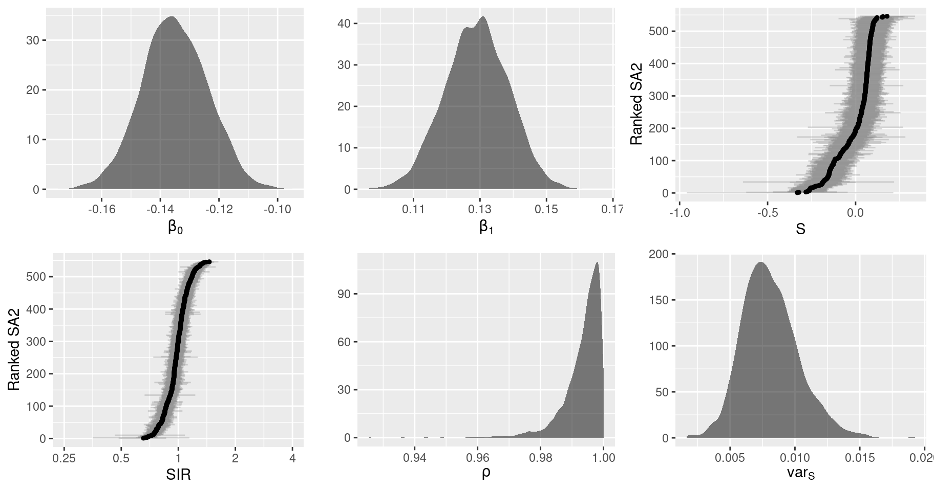
names(pars)## [1] "S" "rho" "sigma.sq.s" "fitted" "Y" "beta.0" "beta.1" "mu"There are many ways we can summarise these results. Useful summaries include the marginal posterior distributions, which indicate the estimates of the model parameters and their uncertainty, and spatial patterns derived from the spatial parameters which we can summarise using thematic maps similar to those we created earlier.
First, lets summarise the marginal posterior distributions. Graphical summaries are useful here, but the type of plot depends on the dimensions (and interpretation) of the particular parameter. For univariate parameters, like the overall intercept \(\beta_0\), a density plot is sensible. For bivariate parameters, individual densities may be feasible for each indexed parameter if there are only a few parameters (using transparency and allowing them to overlap), otherwise a less cluttered approach is to summarise each parameter with a point and interval estimate (e.g. median and 90% credible interval), using one axis to show the index of that additional dimension. If the bivariate parameter is ordered, then it makes sense to plot the estimates in that order. For spatial parameters like \(S\) and \(\mu\), the indices are usually not that meaningful. Another option is to re-order the areas according to the magnitude of the point estimate. This emphasises extreme values (at the tails) and makes the plot much clearer, especially when there are a large number of areas. Additionally, the relative risk (i.e. SIR) is best interpreted on a ratio scale rather than a linear scale. The easiest way to accomplish this is to plot the log-relative risk and adjust the axis labels to reflect the exponentiated values.
# Total number of sub-plots
gg.post <- vector("list", 6)

# Plot for beta_0
dat <- data.frame(val = pars$beta.0)
gg.post[[1]] <- ggplot(dat, aes(x = val)) +
    geom_density(fill = "black", alpha = 0.5, color = NA) +
    scale_x_continuous(expression(beta[0])) +
    scale_y_continuous("")

# Plot for beta_1
dat <- data.frame(val = pars$beta.1)
gg.post[[2]] <- ggplot(dat, aes(x = val)) +
    geom_density(fill = "black", alpha = 0.5, color = NA) +
    scale_x_continuous(expression(beta[1])) +
    scale_y_continuous("")

# Plot for S
dat <- pars$S
mean <- apply(dat, 2, mean)
CI.lower <- apply(dat, 2, quantile, probs = 0.025)
CI.upper <- apply(dat, 2, quantile, probs = 0.975)
rank <- order(order(mean))
dat <- data.frame(id = rank, mean, CI.lower, CI.upper)
gg.post[[3]] <- ggplot(dat, aes(x = id, y = mean)) +
    geom_pointrange(aes(ymin = CI.lower, ymax = CI.upper),
        alpha = 0.3, fatten = 0.1, colour = "grey50") +
    geom_point(size = 1) +
    scale_x_continuous("Ranked SA2", breaks = seq(0, N, 100)) +
    scale_y_continuous("S") +
    coord_flip()

# Plot for relative risk (SIR)
SIR.labels <- c(0.25, 0.5, 1, 2, 4) # Ratio scale labels
dat <- pars$mu
mean <- apply(dat, 2, mean)
CI.lower <- apply(dat, 2, quantile, probs = 0.025)
CI.upper <- apply(dat, 2, quantile, probs = 0.975)
rank <- order(order(mean))
dat <- data.frame(id = rank, mean, CI.lower, CI.upper)
gg.post[[4]] <- ggplot(dat, aes(x = id, y = mean)) +
    geom_pointrange(aes(ymin = CI.lower, ymax = CI.upper),
        alpha = 0.3, fatten = 0.1, colour = "grey50") +
    geom_point(size = 1) +
    scale_x_continuous("Ranked SA2", breaks = seq(0, N, 100)) +
    scale_y_continuous("SIR", breaks = log(SIR.labels), labels = SIR.labels) +
    coord_flip(ylim = log(range(SIR.labels)))

# Plot for rho
dat <- data.frame(val = pars$rho)
gg.post[[5]] <- ggplot(dat, aes(x = val)) +
    geom_density(fill = "black", alpha = 0.5, color = NA) +
    scale_x_continuous(expression(rho)) +
    scale_y_continuous("")

# Plot for sigma^2
dat <- data.frame(val = pars$sigma.sq.s)
gg.post[[6]] <- ggplot(dat, aes(x = val)) +
    geom_density(fill = "black", alpha = 0.5, color = NA) +
    scale_x_continuous(expression(var[S])) +
    scale_y_continuous("")

# View combined plots
grid.arrange(
    gg.post[[1]], gg.post[[2]], gg.post[[3]], gg.post[[4]], gg.post[[5]], gg.post[[6]],
    ncol = 3
)
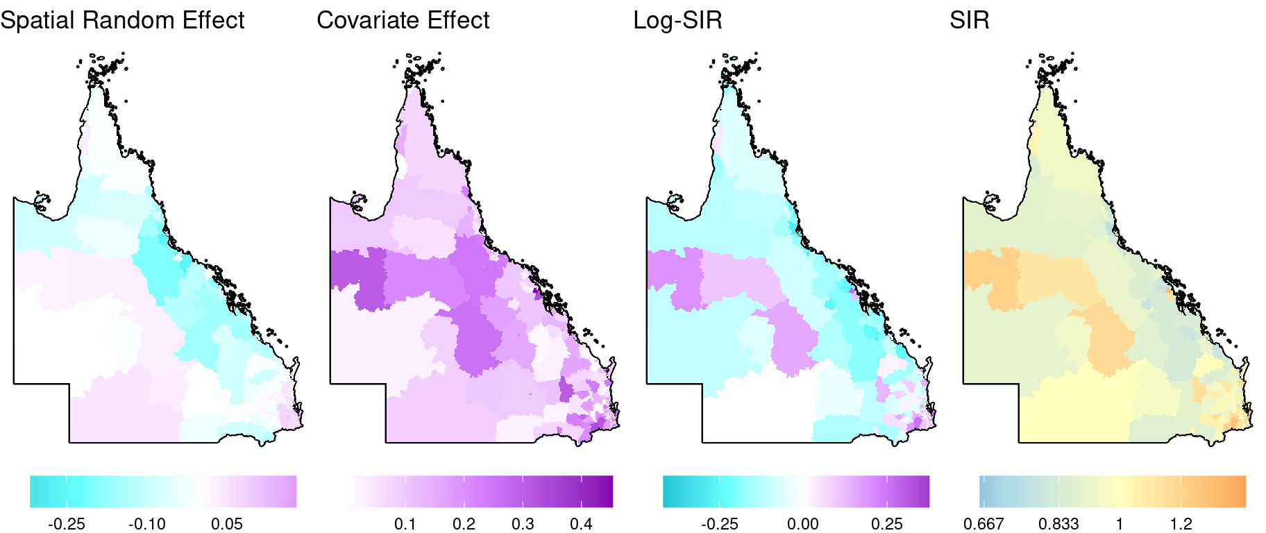
Now for the spatial patterns. Here we ignore the uncertainty and just plot the point estimates. (For the ACA, we include a feature which allows the user to toggle an additional layer which incorporates the uncertainty into the colours shown). We can decompose the log-risk surface (\(\mu_i\)) into its components: the spatial random effect, \(S_i\), and the covariate effect, \(\beta_1 x_i\). The intercept can also be visualised as a spatial layer, albeit each area in this layer will have the same value.
# Add posterior summaries of the model parameters to sf object
dat <- map %>%
    rename(raw.SIR = SIR) %>%
    mutate(
        S = apply(pars$S, 2, median),
        cov = median(pars$beta.1) * x,
        log.SIR = apply(pars$mu, 2, median),
        SIR = exp(log.SIR),
        # Truncate SIRs for plotting
        across(c(raw.SIR, SIR), ~ case_when(
            .x < 1/3 ~ 1/3,
            .x > 3  ~ 3,
            TRUE ~ .x
        ))
    )

# Fill colours
Fill.colours.linear <- c("#00bbcc", "#66ffff", "white", "#d580ff", "#8600b3")
Fill.colours.SIR <- c("#2C7BB6", "#2C7BB6", "#ABD9E9", "#FFFFBF", "#FDAE61", "#D7191C",
    "#D7191C")

# Range of linear components values (for consistent colour legend)
Lims <- dat %>%
    st_drop_geometry() %>%
    select(S, cov, log.SIR) %>%
    range() %>%
    abs()
Lims <- Lims[which.max(Lims)]
Fill.values.linear <- seq(-Lims, Lims, length = 5)

# Range of smoothed SIR values
# Lims <- log2(range(dat$SIR))
Fill.values.SIR <- c(log2(0.25), seq(log2(1/2), log2(2), length = 5), log2(4))

gg.base <- ggplot(data = NULL, aes(geometry = geometry)) +
    theme_void() +
    theme(legend.position = "bottom") +
    guides(fill = guide_colourbar(barwidth = 10))

Breaks.SIR <- c(0.25, 0.5, 1/1.5, 1/1.2, 1, 1.2, 1.5, 2, 4)

gg.1 <- gg.base +
    geom_sf(data = map.border, fill = "grey30", color = "black", linewidth = 0.8) +
    geom_sf(data = dat, aes(fill = S), color = NA) +
    scale_fill_gradientn("",
        colours = Fill.colours.linear,
        values = rescale(Fill.values.linear, from = range(dat$S)),
        breaks = seq(-10, 10, 0.15)) +
    ggtitle("Spatial Random Effect")

gg.2 <- gg.base +
    geom_sf(data = map.border, fill = "grey30", color = "black", linewidth = 0.8) +
    geom_sf(data = dat, aes(fill = cov), color = NA) +
    scale_fill_gradientn("",
        colours = Fill.colours.linear,
        values = rescale(Fill.values.linear, from = range(dat$cov)),
        breaks = seq(-10, 10, 0.1)) +
    ggtitle("Covariate Effect")

gg.3 <- gg.base +
    geom_sf(data = map.border, fill = "grey30", color = "black", linewidth = 0.8) +
    geom_sf(data = dat, aes(fill = log.SIR), color = NA) +
    scale_fill_gradientn("",
        colours = Fill.colours.linear,
        values = rescale(Fill.values.linear, from = range(dat$log.SIR)),
        breaks = seq(-10, 10, 0.25)) +
    ggtitle("Log-SIR")

gg.4 <- gg.base +
    geom_sf(data = map.border, fill = "grey30", color = "black", linewidth = 0.8) +
    geom_sf(data = dat, aes(fill = log2(SIR)), color = NA) +
    scale_fill_gradientn("",
        colours = Fill.colours.SIR,
        values = rescale(Fill.values.SIR, from = range(log2(dat$SIR))),
        breaks = log2(Breaks.SIR),
        labels = round(Breaks.SIR, 3)) +
    ggtitle("SIR")

# View combined plots
grid.arrange(
    arrangeGrob(gg.1, gg.2, gg.3, gg.4, nrow = 1)
)
To see the effect of smoothing, here are the map insets for Brisbane showing the observed (raw) and smoothed SIR side by side. Since they use the same colour scale, we can use facet_grid to simplify the code.
# Restrict SIR data to Brisbane before plotting
dat.2 <- dat %>%
    st_intersection(map.Brisbane.border) %>%
    select(raw.SIR, SIR) %>%
    pivot_longer(cols = c(raw.SIR, SIR), names_to = "variable", values_to = "value")

# Map inset
gg.base +
    geom_sf(data = map.border %>% st_intersection(map.Brisbane.border), colour = "black", fill = "grey30", linewidth = 0.8) +
    geom_sf(data = dat.2, colour = NA, aes(fill = log2(value))) +
    facet_grid(~ variable) +
    scale_fill_gradientn("",
        colours = Fill.colours.SIR,
        values = rescale(Fill.values.SIR, from = range(log2(dat.2$value))),
        limits = range(log2(dat.2$value)),
        breaks = seq(-2, 2),
        labels = round(2^seq(-2, 2), 3)
    ) +
    ggtitle("Observed and smoothed SIR (Brisbane)")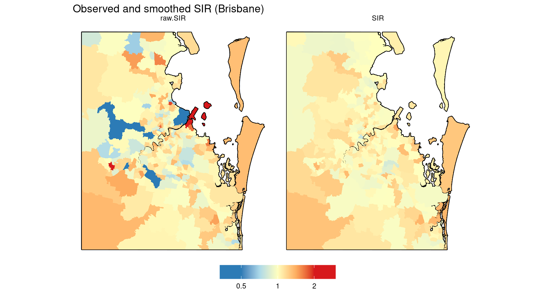
As an alternative visualisation of the smoothing, we could plot both the observed and smoothed SIRs against the SA2 IDs, ranked according to the magnitude of one of the SIRs. This is illustrated in the following plot, where the SA2s are ranked by the smoothed SIR.
dat <- map %>%
    rename(raw.SIR = SIR) %>%
    mutate(
        SIR = exp(apply(pars$mu, 2, median)),
        # Truncate maximum SIRs for plotting
        across(c(raw.SIR, SIR), ~ ifelse(.x > 4, 4, .x)),
        # Add ranks
        rank = order(order(SIR))
    )

Breaks.SIR <- c(0.25, 0.5, 1/1.5, 1, 1.5, 2, 4)

ggplot(dat) +
    geom_hline(yintercept = 1, size = 1, colour = grey(0.3)) +
    geom_point(aes(x = rank, y = raw.SIR, shape = "Observed"), size = 2.5) +
    geom_point(aes(x = rank, y = SIR, shape = "Smoothed", colour = log2(SIR)), size = 2.5) +
    scale_x_continuous("Ranked SA2", expand = c(0.01, 0)) +
    scale_y_log10("", breaks = Breaks.SIR,
        labels = round(Breaks.SIR, 3),
        expand = c(0, 0.05)) +
    theme(panel.grid.minor.y = element_blank()) +
    scale_colour_gradientn("",
        colours = Fill.colours.SIR,
        values = rescale(Fill.values.SIR, na.rm = TRUE),
        breaks = log2(Breaks.SIR),
        labels = round(Breaks.SIR, 3),
        limits = range(Fill.values.SIR)
    ) +
    scale_shape_manual("",
        breaks = c("Observed", "Smoothed"),
        values = c("Observed" = 17, "Smoothed" = 16)
    ) +
    guides(colour = guide_colourbar(barheight = unit(8, "cm")))
## Warning in scale_y_log10("", breaks = Breaks.SIR, labels = round(Breaks.SIR, : log-10 transformation introduced infinite values.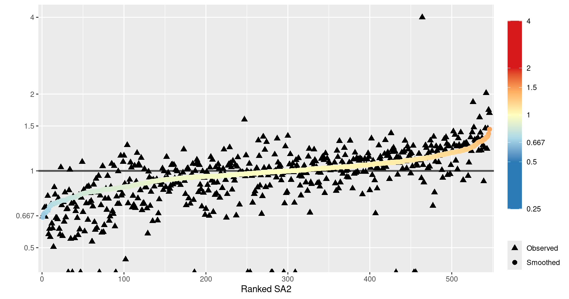
This plot reveals several things about the spatial smoothing.
- The overall effect is clear: the raw SIRs (black triangles) are generally smoothed towards the average (SIR = 1).
- The raw SIRs are generally more extreme than the smoothed SIRs. However, in some cases, the SIR is smoothed further away from 1 or ‘flips’ sides, i.e. smoothed towards 1 and beyond. This is because the values are smoothed towards the mean of the neighbouring SIR values (local mean), as specified by the Leroux CAR prior. (For a more detailed explanation of this behaviour, see Duncan and Mengersen (2020).)
- The triangles at the bottom of the plot represent SA2s with a corresponding observed SIR value of zero (-Inf on the log scale, as indicated by the warning above). This is very unlikely a reflection of the true SIR for these areas. It is not surprising that these SIRs experience a great deal of smoothing.
Regarding point 2, we can compute how many SA2s had a raw SIR smoothed towards the global mean of 1.
dat %>%
    st_drop_geometry() %>%
    tibble() %>%
    select(raw.SIR, SIR) %>%
    mutate(
        towards_global = case_when(
            raw.SIR < 1 & SIR > raw.SIR ~ TRUE,
            raw.SIR < 1 & SIR < raw.SIR ~ TRUE,
            TRUE ~ FALSE
        )
    ) %>%
    group_by(towards_global) %>%
    summarise(n = n()) %>%
    mutate(percent = n / sum(n))
## # A tibble: 2 × 3
## towards_global n percent
## <lgl> <int> <dbl>
## 1 FALSE 256 0.469
## 2 TRUE 290 0.531Just over half of the SA2s have an SIR smoothed toward the global mean.