Chapter 11 Visualisation in the ACA
11.1 Rationale for Visualising Uncertainty
For the ACA, the goal of the statistical modelling was to produce estimates of the SIR and EHR. In terms of cancer incidence, the raw SIR is still an estimate. The uncertainty of this estimate is emphasised when the observed cases are zero or the expected cases are near-zero. The statistical model not only produces smooth estimates, but it also reduces the uncertainty of these estimates. This notion also holds for the EHR, at least conceptually. The following plot demonstrates what this reduction in uncertainty may look like for the Queensland incidence example:
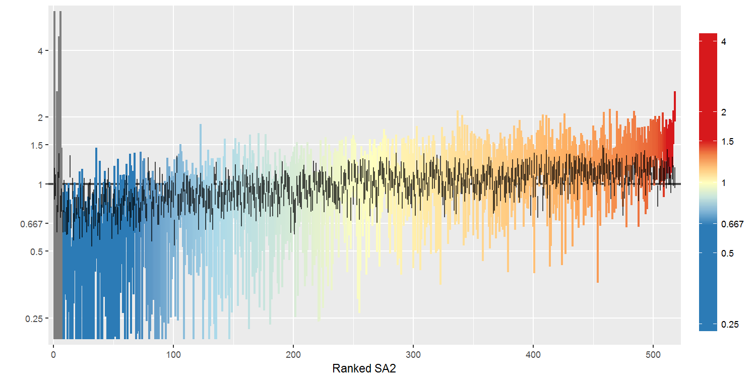
Since similar point estimates with different levels of uncertainty can lead to different inferences and confidence in what the data is telling us, it is important to capture this uncertainty in the atlas.
In the ACA, there are two different aspects of uncertainty that are of interest:
- The uncertainty of the median estimate; and
- The uncertainty that the (median) estimate for a given SA2 is statistically different from the national average.
The first aspect relates to the precision of an estimate. This is addressed by using a credible interval of the estimates. Specifically, both the 60% and 80% credible intervals are used in the ACA. The median represents the middle value if the estimates of the SIR or EHR are ordered, or equivalently, the 50% quantile of this distribution, while the CIs represent quantiles in the tails of the distribution which bound the most plausible estimates. For example, an 80% credible interval corresponds to the 10th and 90th percentiles of the estimated posterior distribution, encompassing the middle 80% of ordered estimates. The median and credible intervals are summary statistics of the empirical density, which is the estimated posterior distribution of the SIR or EHR for a given area. These statistics are summarised visually by the “wave plot”, described in more detail below.
The second aspect relates to the probability (confidence) that an area’s estimate represents a true (significant) difference from the Australian average. The estimated SIR for a given area is interpreted as the risk of being diagnosed relative to the Australian average risk. A similar interpretation holds for the EHR. The Australian average SIR/EHR is 1 by construction. By comparing the posterior sample of SIR/EHR values against 1, we can compute the probability of an area’s estimate being above or below 1. Specifically, the posterior probability of area \(i\)’s SIR estimate being greater than 1 is given by:
\[ PP_{i,\text{high}} = \frac{1}{M}\sum_{m=1}^M{\mathbb{I}\left(SIR_i^{(m)}>1\right)}. \] By symmetry, \(PP_{i,\text{low}} = 1 - PP_{i,\text{high}}\) is the posterior probability of area \(i\)’s estimate being less than 1. To determine whether an estimate is different to 1 (i.e. above or below), a new measure was constructed, \(|PP_{i,\text{high}} - PP_{i,\text{low}}|\), which represents the confidence that the SIRs/EHRs are different from 1. We refer to this statistic as the posterior probability difference (PPD). The PPD is shown in the “V-plot”, and also forms the basis of the “transparency” feature, described below.
11.2 Visualising Uncertainty in the Atlas
11.2.1 Wave Plot and Credible Intervals
Here is an example of the wave plot.
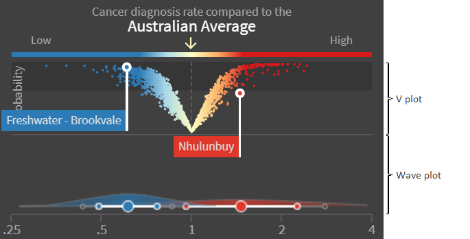
The wave plot indicates the uncertainty of the estimate for the area(s) selected by the user. The features of the wave plot are:
- The large white circle in the centre represents the posterior median estimate for the selected area.
- The white horizontal line capped with the small white circles represents the 60% CI.
- The grey horizontal line capped with the small grey circles represents the 80% CI.
- The shaded density (the “wave”) represents the empirical distribution of the estimates (i.e. the posterior distribution).
11.2.2 V-plot
Here is an example of the V-plot.
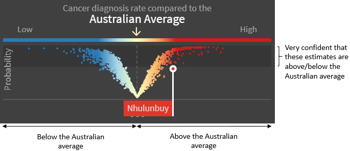
The x-axis shows the value of the estimate in relation to the Australian average. Dots to the left of the centre represent SA2s with an estimate less than 1; dots to the right of the centre represent SA2s with an estimate greater than 1.
The y-axis shows the probability, or confidence, that the estimate is different to the Australian average. Dots closer to the top of the V-plot are more likely to reflect a real difference to the Australian average, while dots closer to the bottom of the V-plot do not. The dark grey background spanning the top 40% region of the V-plot highlights SA2s which have a PPD value > 0.6.
11.2.3 Transparency
On the atlas, estimates of the SIR/EHR are mapped to a spectrum of colours so that SA2s with a corresponding value less than 1 are shown in blue, values close to 1 are shown in yellow, and values greater than 1 are shown in red.
An alternative visualisation of the atlas is also available in which the colours are modified according to the PPD value. This is created from a superposition of two layers: one containing the spectrum of colours blue-yellow-red for the estimate values, and one containing yellow fading to transparency as the PPD value increases from 0 to 1. The effect is that SA2s that are situated towards the bottom-left or bottom-right are assigned a colour that is more yellow. This is illustrated by the following image.

Users have the option to toggle this transparency feature on or off. By default, transparency is enabled. In this case, the atlas takes into account not only the estimates, but also how confident we are that the differences are real differences (no transparency), rather than being due to chance (lots of transparency).
The following plot highlights the visual difference between the two modes.
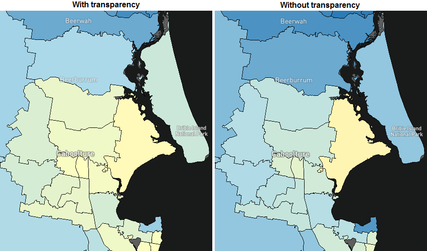
The difference between these two visualisations depends on how wide the V-plot is. If the V-plot is narrow such that most of the dots represent an estimate close to 1 (x-axis), then the transparency effect will be minimal. The converse is also true.
When the transparency feature is on, areas that appear yellow can be interpreted as either having an estimate that is close to the national average (with low or high uncertainty) or the probability of being different to the national average is low. These two outcomes can be consolidated simply as “unlikely to be different from the national average.”
11.3 The Process of Development
This section describes the process of development of the visualisation components of the atlas, showing the transition from the early design concepts to the final versions used in the atlas. The changes were made in response to feedback collected from the general public, key stakeholders, and expert consultants, as well as extensive testing and dialogue from regular meetings between the project leads, investigators, and ViseR team (see Section 2.2.1).
The process of development was defined by six key milestones:

In addition to the conceptual design, the following examples also highlight choices relating to wording, positioning, and aesthetics such as colour schemes.
11.3.1 Wave Plot
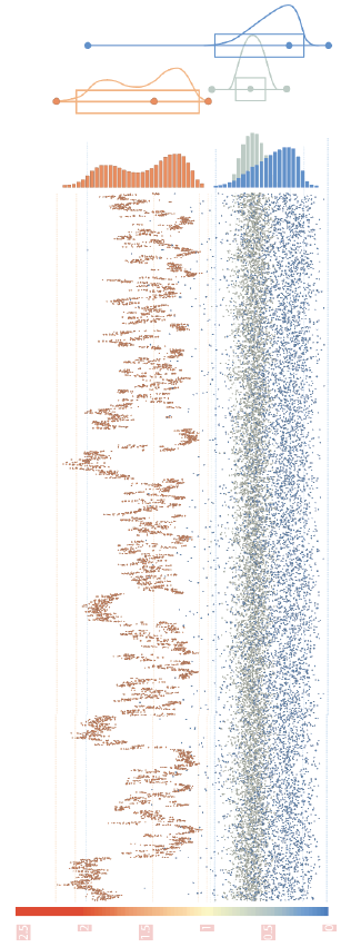 The origins of the wave plot were based on the empirical density of the estimates for the SIR and EHR. To emphasise the uncertainty and skewness, this was overlaid with a box-plot. It was envisaged that the combination of the two plot types gave the clearest representation of the estimates and their uncertainty.
The density plots gave rise to the idea of using violin plots instead, which mirrors the density around the baseline.
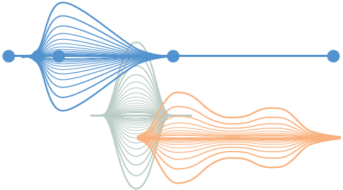
The idea of layering the violin plots to highlight credible intervals or higher density regions was also considered.
In addition to the SIR/EHR estimate and its uncertainty, another key statistic that we wished to include in the atlas was the probability of the estimate being above (or below) the Australian average. This led to the idea of adjusting the vertical position of the violin plot to reflect the probability.
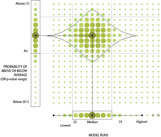
To further convey that the estimates were obtained from a finite sample generated by the MCMC process, the idea of using different sized dots to represent the density was also explored. This underlying process would be illustrated by initially showing all the dots at the same size and using a simple animation to increase the size of the dots iteratively, as if being sampled in real time, eventually converging to the plot shown above. Alternative representations were also considered, with a focus on how this plot may look when two areas were selected for a side-by-side comparison - an important feature of the atlas.
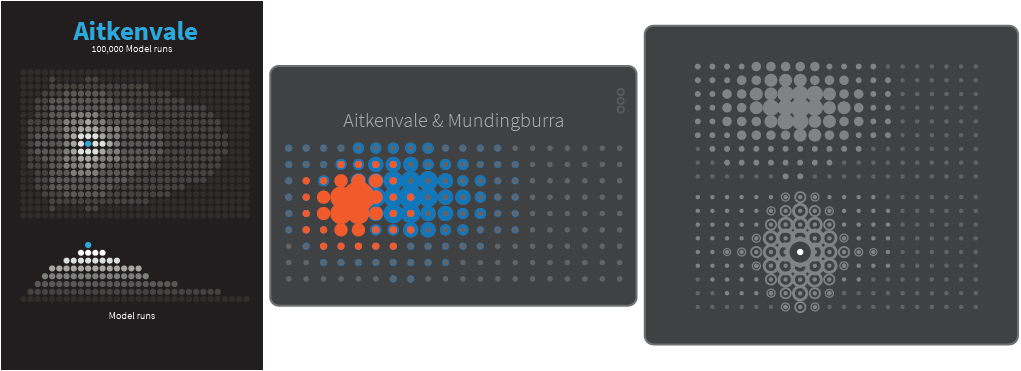
The figure below shows the two options presented to the focus groups. The feedback was that the simpler plot on the left was preferred.
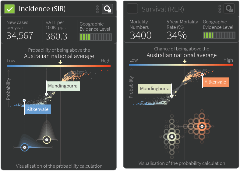
Partly in response to make these plots simpler and easier to interpret, and partly due to the realisation that it was nonsensical to translate densities vertically since comparison of densities required a common baseline (regardless of whether the y-axis is shown explicitly), the ideas of using dots and repurposing the y-axis were both abandoned. In the subsequent weeks, the layers were replaced with a solid colour, and the overlaying boxplot was replaced with dots representing the posterior mean and 60% and 80% credible intervals (see Section 11.2.1).
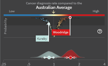
The last major development in the wave plot was the one that gave it its name. Shortly before the launch, it was decided that the x-axis needed to be labelled explicitly (it was expected that a user could click on the median and credible intervals which would overlay the plot to see their values anyway). This introduced a new problem. The SIR and EHR are ratio scale parameters, but densities only make sense on a linear scale, otherwise the area under the curve resulting from the non-linear intervals is inconsistent. The solution was to actually plot the empirical density for the logarithm of the SIR/EHR, but relabel the x-axis to reflect the ratio scale. These densities are therefore not true densities, but are analogous in their interpretation. Hence the term “wave plot” was coined as a reference to the shape of the plot and to earlier ideas such as layering of the violin plots, hinting at the process that generates that plots. The idea of visualising the probability that estimates were above (or below) the Australian average were deferred to the V-plot.
11.3.2 V-plot
While the wave plot indicates the uncertainty of the SIR/EHR estimates, the purpose of the V-plot was to indicate whether the estimates represented a significant difference to the Australia average. Initially, this took the form of a scatterplot with the x-axis representing the point estimates (which aligned with the wave plot below it), and the y-axis representing the posterior probability that the estimates were greater than 1, the Australian average. This resulted in the points taking an “S” shape.
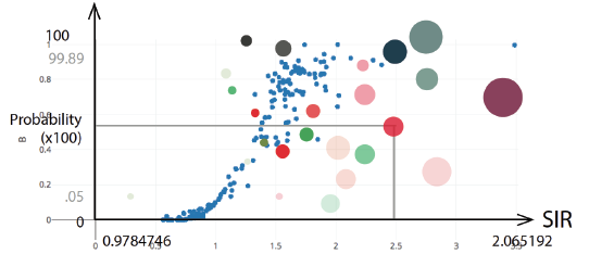
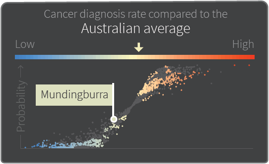
The V-plot was created as an alternative, where the y-axis represented the PPD defined in Section 11.1, leading to the points resembling a “V” shape. Both the S-plot and V-plot were tested with the focus groups. The preference was for the V-plot as it was easier to interpret. Additionally, the S-plot seemed to place more emphasis on areas with estimates greater than 1 compared to areas with estimates less than 1, whereas, the goal was to emphasise estimates that were different from 1, either greater or less than 1. The interpretation of the V-plot was more straightforward and more closely aligned with this goal. Consequently, the V-plot was chosen over of the S-plot.
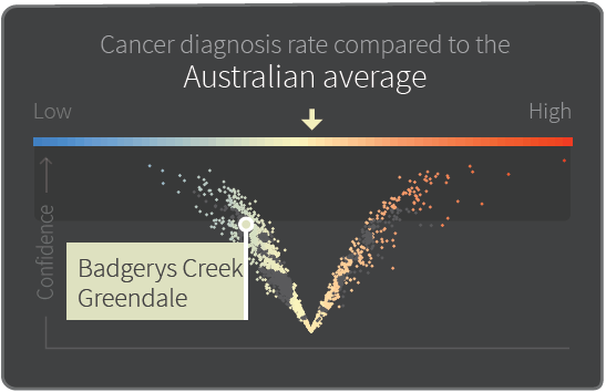
Three major design choices relating to the visualisation and interpretation of the V-plot were discussed leading up to the stakeholder workshop.
11.3.2.1 Colour Thresholds and Truncation Limits
The ACA uses a diverging colour scheme to delineate between low and high cancer incidence or survival (see Section 11.2.3). One property that greatly affects how these measures of cancer burden appear on the maps and in the V-plot is the thresholds used for the limits corresponding to the darkest shades of blue and red. Various thresholds were considered, the narrowest interval being 0.8 to 1.25, and the widest interval being 0.125 to 8, while an interval of 0.5 to 2 had been assumed throughout development up till this point. The effect of changing these thresholds can be seen in the figure below.

The problem with making the interval too wide is that maps appear “washed out”, making it impossible to distinguish between areas that represent a real difference to the Australian average, and those that don’t. Conversely, making the interval too narrow makes distinction between areas with values close to those thresholds impossible, and may exaggerate the existence of spatial variation where none exists. It was decided that thresholds of 0.667 and 1.5 were a reasonable compromise when all cancers were considered. Areas with estimates larger than 1.5 or less than 0.667 were assigned the same red or blue colour as the limits.
A related issue is the limits of the x-axis on the V-plot. While the colour gradient only ranges from 0.667 to 1.5, estimates outside this range are still shown on the V-plot. To maintain clarity of the V-plot while minimising screen space and the number of truncated values, values outside the range 0.25 to 4 were truncated to these limits. (Note that the labels of the x-axis are only visible when 1 or 2 SA2s are selected by the user.)
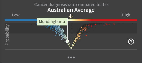
For specific details of the colours used on the map, see Section 11.3.4.
11.3.2.2 Interpreting the y-axis: Probability vs Confidence
When the S-plot was the proposed visualisation, the y-axis had a straightforward interpretation, at least mathematically, namely the posterior probability that the estimates were greater than 1. While the transition from the S-plot to the V-plot was readily agreed upon, it was not immediately apparent what the y-axis represented, let alone how it should be interpreted. Did it still represent a probability, or was it a level of confidence?
There was much to and fro on this subject, as evidenced by the images throughout this section which show both terms in use. What was fairly clear was that neither the word “probability” nor “confidence” alone was sufficient in describing this axis. However, due to space limitations, a long axis name was not possible. The solution was to supplement this short axis name with a more descriptive name that pops up when the user moves the mouse cursor over the axis. Examples of the ideas proposed for this descriptive name were:
- Confidence that the SIR (EHR) is really different from the national average
- Probability of being different to the Australian average.
It was also fairly clear that the PPD (Section 11.1) was the basis for the V-plot y-axis. Further scrutiny of the formula suggested that this quantity was best interpreted as a scaled probability, i.e.
\[\begin{align*} \text{PPD} = & \left| PP_{i,\text{high}} - PP_{i,\text{low}}\right| \\ = & 2 \left| PP_{i,\text{high}} - 0.5 \right| \end{align*}\]
Hence “probability” is the label that appears on the y-axis.
11.3.2.3 Threshold for Determining a Real Difference
The V-plot is divided into two sections by way of a darker shaded region. The cut-off is based on Richardson et al. (2004) who recommended using a cut-off probability of 0.8 for detecting elevated values of relative risk, i.e. \(PP_{i,\text{high}} \geq 0.8\) indicates the estimate for area i is genuinely greater than 1. If there is equal interest in areas that are much lower than the Australian average, then this corresponds to a lower cut-off of 0.2. Given the symmetry with \(PP_{i,\text{low}}\), this translates into a PPD threshold of 0.6. Note that this threshold is also used as the basis for the wording used in the area selection pop-up windows (see Section 11.3.5).
11.3.3 Estimates Overview (Barcode Plot)
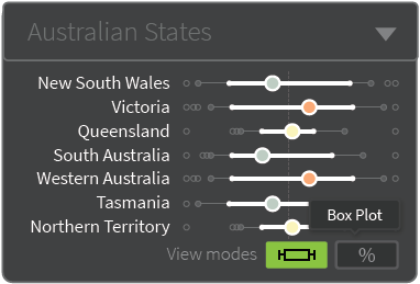
One of the hurdles encountered early in the development of the visualisations was displaying the estimates for small, tightly clustered areas such as those found around major cities while maintaining a national perspective of the atlas. (Zoom functionality was always going to be an option, but zooming into a subregion of the map loses the national perspective). The initial solution to this problem was to cover up the capital city regions, where most of the invisibly small areas occurred, with a doughnut chart indicating the percentage of area-specific estimates that fell within a small discrete bin range. At the second visualisation workshop, two modifications were suggested: moving the summary charts to be adjacent to the cities rather than covering them up, and using barcode plots instead of doughnut charts.
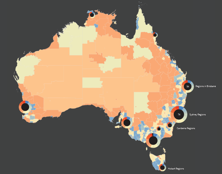
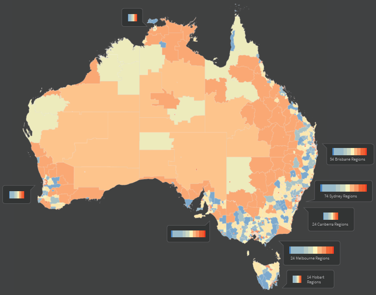
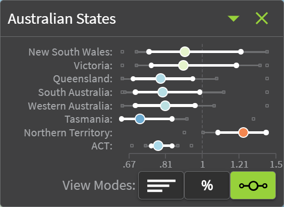
These barcode plots represented the current stage of development at the time of the focus groups. One limitation of the barcode plots was that if the same concept was used for inland regions like Alice Springs which are equally imperceptible, the barcode plots would cover too much of the map. This was the feedback collected from the focus groups. After further discussion amongst ViseR and the main project investigators, three further modifications were made: moving the barcode plots and merging them into a separate visual component, introducing an alternative view mode (showing number of SA2s rather than percentage), and introducing an alternative grouping structure (Australian states rather than just capital cities). These changes were welcomed by those present at the Project Update meeting.

The grouping structures were subsequently extended to include socioeconomic status and remoteness areas.

A new view mode was also added, which shows the distribution of SA2-specific estimates summarised in a format similar to a boxplot. Additional minor improvements were added prior to the launch in September 2018, such as the inclusion of an x-axis.
11.3.4 Main Atlas Maps
Another important aspect of the atlas which underlines the uncertainty of the estimates is the transparency feature on the maps themselves, as described in Sections 11.1 and 11.2.3.
This feature was first proposed at the project update meeting with selected external stakeholders. Two design choices needed to be made: the opaque colour to use in the transparency layer, and whether to apply this feature only for the area that the user passes the mouse cursor over or Australia-wide with an option to toggle it on and off.
Regarding what colour to use in the transparency layer, two ideas were floated: a grey colour or the same yellow colour used for areas with estimates equal to the Australia average. The yellow colour was chosen for two reasons. First, shades of grey were already used for areas without estimates and also for areas which had been filtered by the user, so to maintain unambiguous interpretation of the maps, a third shade would need to be introduced. Second, by using the same colour as the Australian average, it facilitated a simple and congruous interpretation of the estimates when the transparency was turned on - yellow areas have estimates that are unlikely to be different from the Australian average. Regarding the second design choice, the toggle option was chosen.
The next decision was to finalise how the transparency was applied. Initially, this was a linear transition from 0 (transparent) to 1 (opaque) as the PPD value increased from 0 to 0.6, the cut-off corresponding to the top 40% region of the V-plot (see Section 11.2.2). (Here, the transparency values refer to the effect of the transparency layer, so 0 transparency indicates no change to the blue-red hues.) Several other configurations were considered, as illustrated below.
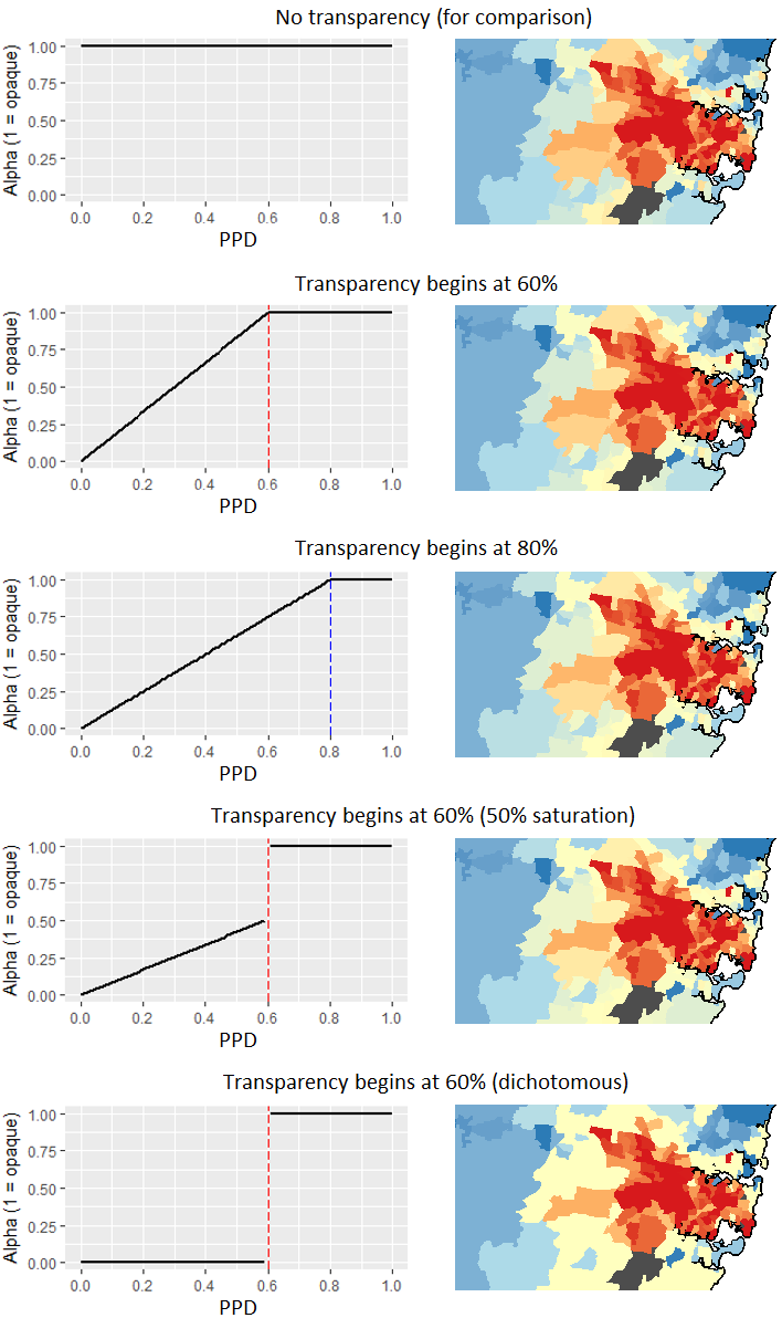
Ultimately, it was decided to compute the transparency by setting the alpha value equal to the PPD value, ignoring the threshold used in the V-plot. All of these design choices were finalised two months prior to the launch.
Closer to the launch date, the colour scheme was updated to provide a high contrast between the yellow used for the Australian average, and the blue and red hues for the most extreme estimates. This improved identifiability of areas that had estimates different to the Australian average, especially when the transparency feature was applied. Note that the colours are based on the red-yellow-blue diverging colour scheme from ColorBrewer (http://colorbrewer2.org). Specifically, the hexadecimal colour values and their corresponding SIR/EHR value threshold are as follows:
| SIR/EHR threshold | Natural log | Hex colour code |
|---|---|---|
| 0.6667 | -0.4055 | #2C7BB6 |
| 0.8165 | -0.2027 | #ABD9E9 |
| 1 | 0 | #FFFFBF |
| 1.2247 | 0.2027 | #FDAE61 |
| 1.5 | 0.4055 | #D7191C |
Aside from the high contrast, this colour palette was chosen because it is colour-blind friendly and the cold and warm tones intuitively reflect low and high values respectively. (When choosing colours, the Color Blindness Simulator (https://www.color-blindness.com/coblis-color-blindness-simulator) is helpful in understanding how maps look to users with various colour vision deficiencies.)
11.3.5 Area Selection Pop-Up Windows
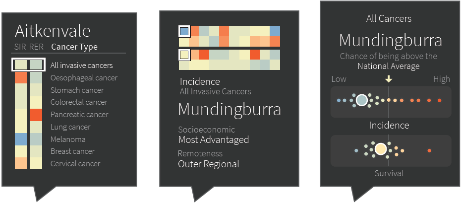
While the maps presented in the atlas were useful for viewing the spatial variation in SIR/EHR at a national level, there was no easy way to compare differences between cancer types. The solution to this was a feature which facilitates comparison of two areas: when a user clicks on an SA2, a pop-up window would appear which shows a summary of indicators for each cancer type. A second window would appear if a second area was selected. The following figure was early design concept.
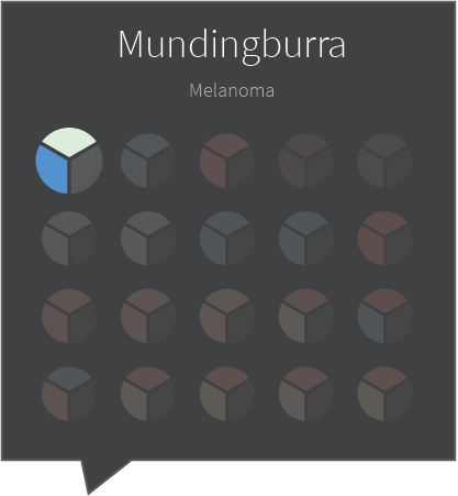
The idea was that each chart represented a different cancer type, and each segment represented an indicator: SIR, EHR, and a third indicator was discussed but later abandoned. Variations of this feature, shown below, were presented at the focus groups in March 2018.
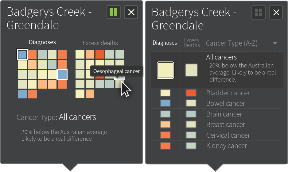
By the time of the Project Update meeting, this had been further refined. Two views were provided, which the user can switch between, a grid view and a list view. Both views provided a description of the estimate as it compares to the Australian average, and whether this is likely to be a real difference or not, according to the PPD threshold (see 12.3.2.3).
11.3.6 Other Developments
Throughout the development of the atlas, the ViseR team were also committed to designing a mobile-friendly version. Development of the mobile app begin early in the project, around the time of the first Visualisation Workshop. One important decision throughout its development was screen positioning to ensure the best use of space on small screens while maintaining functionality and a user-friendly experience. Some examples of mobile screen mock-ups are shown below.
