Chapter 2 Overview of the ACA
2.1 Rationale for an Australian Cancer Atlas
There is substantial evidence that where you live matters. Achieving health equity for all Australians, regardless of race, income and where they live was identified as the greatest health challenge faced by Australia (Armstrong et al. 2007). Quantifying the extent and patterns of geographical inequalities in cancer is a first essential step to addressing this challenge.
In 2007, the Cancer Council New South Wales released cancer maps for New South Wales, which provided information about incidence and mortality rates by local government area, and used Bayesian models to reduce the spurious variation. In part, motivated by this work, the Cancer Council Queensland released the Atlas of Cancer in Queensland (Cramb, Mengersen, and Baade 2011a, 2011b). This provided the first evidence of the extent of small area spatial variation for cancer incidence and survival across Queensland, and utilised smoothing methods through fully Bayesian spatial models.
Other states have previously produced cancer atlases [Bois et al. (2007); Threlfall], however they were limited in that they were static documents, not easily updated and state-specific. In addition, the different time periods, statistical methods and geographical units made it impossible to get a perspective of what was happening at a national level.
In 2017, as part of their Social Health Atlas of Australia, researchers at Torrens University included some information about geographical variations in cancer incidence across small areas of Australia (Public Health Information Development Unit, Torrens University Australia [PHIDU] 2016). This was an important initiative, however with its focus on social determinants of health, the Social Health Atlas only provided limited information about cancer incidence and mortality for a small number of cancers, and no details about patterns in cancer survival. Due to the analysis methodology and the small numbers involved, the estimates for many geographical areas needed to be suppressed or combined with other neighbouring areas.
In early 2018, the Australian Institute of Health and Welfare released cancer incidence and mortality statistics by SA3 areas. In addition to not including any information about cancer survival, using SA3 areas would likely result in a much greater heterogeneity of outcomes within areas compared to SA2 areas. In addition, the information was only available through EXCEL spreadsheets, for a limited number of cancer types, and no estimates of uncertainty were provided around the published rates or rate ratios.
2.2 Early Stages of Development
In 2014 the idea of a national atlas for cancer was first discussed by the Project Investigators. This progressed to our formal funding application with FrontierSI (formerly CRC-Spatial Information), Cancer Council Queensland, Queensland University of Technology and Australian Institute of Health and Welfare being involved. Prior to seeking formal approval, and also gaining the support for the project from the Australasian Association of Cancer Registries. Complicating the data extraction was that each Australian state and territory cancer registry has its own approval process, requiring ethics approval from four separate human research ethics committees (Queensland, New South Wales, Northern Territory and Australian Capital Territory) and eight separate data custodians. More than two years was needed to progress from initial ideas through the various funding applications, ethics approvals and data custodian approvals.
The work on the Atlas officially started in January 2017.
2.2.1 The ACA Investigation Team
The ACA involved collaboration between many experts from several organisations. The major organisations involved were:
- Queensland University of Technology (QUT)
- Cancer Council, Queensland (CCQ)
- Australian Institute of Health and Welfare (AIHW)
- Visualisation and e-Research (ViseR) group, QUT
- Monash University
- FrontierSI, formerly the Cooperative Research Council for Spatial Information (CRCSI)
In addition, a Project Advisory Group made up of national experts in their relevant fields was set up for the duration of the Atlas development, and through Quarterly meetings provided overall guidance for the development and implementation of the Atlas.
Project leads:
Kerrie Mengersen (QUT)
Peter Baade (CCQ)
Other investigators and research staff:
Susanna Cramb (CCQ)
Earl Duncan (QUT)
Joanne Aitken (CCQ)
Upeksha Chandrasiri (CCQ)
Jessie Roberts (QUT)
Nicole White (QUT)
Bill Watson (AIHW)
Visualisation:
Thom Saunders (ViseR)
Sarah Quijano (ViseR)
Stephanie Kobakian(Monash)
Dianne Cook (Monash)
Sarah Goodwin (Monash)
Gavin Winter (ViseR)
Andy Gordon (CCQ)
Sarah Quijano (ViseR)
Albert van der Weerd (CCQ)
Jad Goss (CCQ)
Tim Gurnett (ViseR)
Allan James (ViseR)
Ben Kleverlann (ViseR)
Sofia Price (CCQ)
Justin Feakes (CCQ)
Other consultants and past investigators:
Paula Fievez (FrontierSI)
Chris McAlister (CRCSI)
Pamela Burrage (QUT)
James McGree (QUT)
David Houslip (CCQ)
Paula Moraga-Serrano (QUT)
Media and Communications:
Laura McKoy (CCQ)
Theresa Lennox (CCQ)
Abby Page (CCQ)
Stephanie Pradier (FrontierSI)
Karen Millner (QUT)
David Roder (Chair-UniSA)
Bill Watson (AIHW)
Jeff Dunn (USQ)
Gail Garvey (Menzies SHR)
Sarah Goodwin (Monash)
Katina D’Onise (SADoH&A)
Louise Ryan (UTS)
John Dowling (WA Health)
Giam Kar (NT AWCCC)
Laura McKoy (CCQ)
2.2.2 Funding and Support
The Australian Cancer Atlas was a collaborative study, funded by the Co-operative Research Centre for Spatial Information (CRCSI), CCQ, AIHW and QUT, with the support of the Centre for Research Excellence in Prostate Cancer Survivorship (CRE-PCS), and endorsed by the Australasian Association of Cancer Registries and Cancer Council Australia.
2.2.3 Purpose and Scoping
The purpose of the Australian Cancer Atlas was to quantify the small area spatial patterns in cancer incidence and survival using the latest spatial modelling techniques and visualisation methods. The Atlas was designed to provide an interactive digital product, making it freely accessible to a wide audience.
In early 2017 we initiated a scoping process conducted by the independent company NGIS (https://ngis.com.au/). This process was designed to get a consensus about the practical implementation of the aims and objectives. The scoping led to these guiding principles, which in turn informed decisions made during the remainder of the project.
- User-centric design
- Informative to a diverse range of users
- Use of novel and effective visualisation
- High performance
- Clear communication of science and outcomes
- Low barrier to entry
The scoping process also identified a number of key users for the Atlas, and then these were streamlined into four target groups - the general public, policy users, scientific researchers and health practitioners. When designing the Atlas, consideration was given to why each group would use the atlas and their skill levels.
2.3 Key Components of the Atlas
2.3.1 Getting the Data
Cancer incidence and survival data were obtained from all eight Australian state and territory cancer registries. This includes 20 of the most common types of cancer (including all cancers combined). The cohort was aged 15 years and over at diagnosis (15-89 years for survival analysis). All data were stored and analysed on the SURE secure remote computing facility (SAX Institute).
2.3.1.1 Geography
Geographical areas used are the Statistical Areas Level 2 (SA2) classification defined by the Australian Bureau of Statistics (ABS).
| Category | Description/purpose | Typical population size (2011) | Number of units in Australia (2011) |
|---|---|---|---|
| Mesh Blocks | Geographical building blocks | 30-60 dwellings | 347,000 |
| SA1 | Highest spatial detail | 200-800 people | 55,000 |
| SA2 | Community interacts socially and economically | 3,000-25,000 | 2,214 |
| SA3 | Output of regional data | 30,000-130,000 | 333 |
| SA4 | Reflect labour markets | 100,000+ | 88 |
| State/ Territories* | 8 |
* Excluding “other territories”
SA2 are the smallest areas that:
- have annual estimated resident population data readily available; and
- data custodians for cancer registries were willing to provide cancer data for.
The ABS define their purpose to “represent a community that interacts together socially and economically.” SA2s have the advantage of having a reasonable concordance between the combination of postcode and suburb.
Some of the SA2s were excluded for various reasons.

There was potential for misclassification:
- SA2 based on address information of usual residence at the time of diagnosis.
- Geocoding on full street address - NSW, ACT, Tas, Vic, WA.
- Geocoding using suburb and postcode - QLD.
- Concordance file using suburb and postcode - SA.
- Suburb name (urban) and other location information (rural) - NT.
To identify areas with potentially misclassified data, we examined maps of cancer incidence using existing data, looking for area(s) with high incidence adjacent to area(s) of very low incidence. We tried to be systematic with process, rather than subjective.
Once areas had been identified, we contacted relevant cancer registries to confirm best resolution, and they appreciated the quality improvement process. Four cancer registries re-supplied us with updated/corrected geographical data. After discussions with the relevant data custodian, records for other “problematic” areas were randomly allocated across adjacent areas.
2.3.1.2 Measures
Two main measures were included in the Atlas.
Cancer diagnosis rates was defined as the number of new cancers diagnosed among people living in a defined geographical area within a given time period, divided by the population at risk.
Determining the best way to present the relative survival estimates was more complicated. Given the statistical models for survival work on the hazard scale, we decided to report the survival results in terms of excess deaths. Excess deaths within 5 years gives the estimate of the mortality burden caused by a cancer within 5 years of diagnosis.
As an example, a 40% 5-year excess death rate for a cancer means that people diagnosed with that cancer are 40% more likely to die within five years of diagnosis than the general population, after accounting for age at diagnosis.
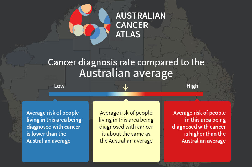
Both measures are reported in the Atlas in terms of how they compare to the Australian average. This open splash screen shot shows the interpretation for cancer diagnosis, but the same principal holds for excess deaths. Areas shown in blue are where, for residents in that area, the average risk of being diagnosed with cancer is lower than the Australian average. Areas shown in yellow are those where the average risk is considered equal, and areas shown in orange or red are where the average risk for residents is higher than the Australian average.
The null hypothesis for the statistical modelling is that there is no geographical variation in cancer incidence or survival. To detect evidence of variation, we required `sufficient’ numbers of cancers to make the modelling process meaningful. For the Atlas we selected all invasive cancers combined, plus 19 other common cancer types, with the definitions for each cancer type being consistent with those used by the AIHW (Table 1). Of note we did not include breast cancer among males due to insufficient numbers, nor basal cell and squamous cell skin cancers which are not collected by cancer registries in Australia.
Table: Cancer types classified according to the 2016 version of the International Classification of Diseases (ICD-10).
| Cancer type | ICD-10 Code(s) |
|---|---|
| All malignant cancer | C00-C97, D45, D46, D47.1, D47.3-D47.5 |
| Bowel (colorectal) cancer | C18-C20 |
| Brain cancer | C71 |
| Breast cancer* | C50 |
| Cervical cancer* | C53 |
| Head and neck cancer | C00-C14, C30-C32 |
| Kidney cancer | C64 |
| Leukaemia | C91-C95 |
| Liver cancer | C22 |
| Lung cancer | C33-C34 |
| Melanoma of the skin | C43 |
| Myeloma | C90 |
| Non-Hodgkin lymphoma | C82-C86 |
| Oesophageal cancer | C15 |
| Ovarian cancer* | C56 |
| Pancreatic cancer | C25 |
| Prostate cancer ** | C61 |
| Stomach cancer | C16 |
| Thyroid cancer | C73 |
| Uterine cancer* | C54-C55 |
\(\hspace{12em}\) * Females only; ** Males only
The average annual numbers of cancers diagnosed in Australia between 2010 and 2014 was 123,312, with 68,724 of these being among males, and 54,588 among females. Of the specific cancers included in the Atlas, prostate (19,980) and breast (15,504) were the most common cancers among males and females respectively, while thyroid cancer (662) and oesophageal (417) were the least common.
2.3.1.3 Time period
The data extract covered 1996 to 2014 (inclusive), except NSW which only had data available up to 2013.
The data was aggregated over multiple years, the time period depending on how rare the cancer was. For cancer incidence, data were aggregated over the 5 year period 2010-2014 for all cancers combined, breast, bowel, lung, melanoma and prostate cancers, while data for all other cancers were aggregated over the 10 year period 2005-2014. For excess deaths, data were aggregated across the entire `at-risk’ time period 2006-2014 (constrained by the availability of population mortality data) based on the diagnosis period 2002-2014.
2.3.1.4 Population Data
Area-specific population data was obtained from the ABS for each combination of SA2, year, sex and five-year age group (Australian Bureau of Statistics [ABS] 2017). National population data also available by single year age group (Australian Bureau of Statistics [ABS] 2018).
Population mortality data, which is used for the relative survival calculations (expected mortality), for all causes of death combined during 2006 to 2014 were obtained from the Registries of Births, Deaths and Marriages (Queensland Government [QG] 2018). This data was provided by sex, year of death, age (grouped into 5-year aggregates for calculations) and geographical area. (National data was provided by single year age group). The geographical information was provided by SA2 for the years 2009-2014, and by Statistical Local Area (SLA) for the years 2006-2011 - a classification that preceded SA2s. A concordance file used to convert the 2006-2008 SLA data to SA2 (Australian Bureau of Statistics [ABS] 2013a).
2.3.2 Spatial Smoothing
There are two main reasons for wanting to incorporate spatial smoothing in the atlas: data privacy and statistical stability. Data privacy relates to the responsibility of data custodians to protect the identity of individuals in their data. Statistical stability relates to the inherent random fluctuation of statistics that occurs when there are small numbers of records; the smaller the numbers, the more they fluctuate, making correct interpretation difficult.
In practice, particularly when there are small numbers of cases diagnosed each year, the number of cancers diagnosed varies naturally from year to year. This makes it difficult to see the underlying pattern. For example:
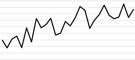
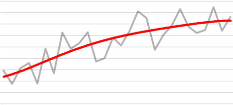
If however, we report the “smoothed” trend (shown by the red line below), it provides greater insight into the underlying patterns in the data.
2.3.2.1 What is Spatial Smoothing?
Spatial smoothing is a statistical technique that `borrows’ information from neighbouring geographical areas, an idea based on the implied assumption that people tend to have similar exposures and lifestyles to those who live in nearby areas. This image illustrates a typical (but hypothetical) impact that smoothing can have on observed geographical data.
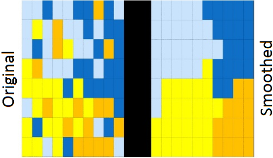
The result of this spatial smoothing is that it increases stability and precision of the estimates. The following figures illustrate these two aspects using another set of fictional data. The first figure shows that, in general, smoothed estimates are pulled towards the Australian average (which is represented by the horizontal red line). The second figure shows that the uncertainty surrounding these estimates has shrunk (or equivalently, the precision has increased) compared to the uncertainty around the observed values.
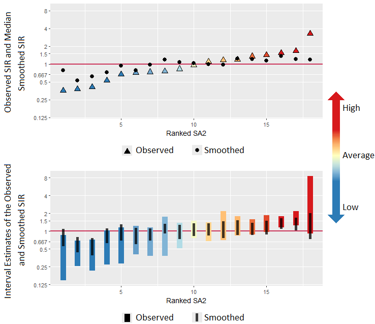
The effects of smoothing are most pronounced in areas with the smallest populations and/or the smallest numbers of cases. Smoothed estimates are designed to highlight the real differences in the underlying cancer rate of areas.
There are several ways to carry out spatial smoothing. For the Atlas we used Bayesian spatial models. Two main advantages of this approach were that Bayesian models can incorporate the spatial correlation between areas, recognising that adjoining geographical areas are likely to have some similar characteristics, and also that by putting probability distributions around each of the unknown quantities, Bayesian models provide a unique capacity to better quantify the extent of uncertainty around these spatial estimates. All the statistical models were run in freely available software, R (R Core Team 2018).
There are also a range of Bayesian spatial models available. Some of these differ in how they define neighbours. Some differ in the model specifications, the type of smoothing and whether they are parametric or semi-parametric forms. A rigorous testing process was undertaken (Cramb et al. 2017) to determine the most appropriate model. The candidate models were compared according to goodness of fit, plausibility of estimates, computational time and feasibility. These tests and the results for each model are discussed in more detail in Section 5.4 and Chapter 6.
2.3.3 Visualisation of Results
The visualisation component of the atlas was led by the Visualisation and eResearch (ViseR) group at QUT (https://research.qut.edu.au/viser). Some of the key milestones in developing the visualisations for the atlas were:
- Visualisation workshops (December 2017 - January 2018)
- Focus groups (March 2018; Canberra, Melbourne, and Brisbane)
- Stakeholder workshop / alpha release (May 2018, Brisbane)
A summary of the historical transitions of the key visual components resulting from the feedback from these meetings is discussed in Section 11.1.
A single number, or the estimate on its own, is not enough to understand the cancer burden in a specific geographical area. As is always the case with statistical estimates, each estimate has a degree of uncertainty, or imprecision, around it. This is because there are many different factors at play that can impact on cancer diagnosis rates and survival, including random (or chance) variation. We calculated the most precise and accurate estimate possible given the available data, and then provide users with an idea of how certain they can be of these estimates.
Three different types of visualisations are used to convey this uncertainty:
- a “wave plot”, similar to a density plot, but for ratio scale parameters;
- a “V-plo”t, a scatterplot of estimates against their uncertainty; and
- a transparency feature on the map itself to make the areas whose estimates have a large amount of uncertainty appear less noticeable in the map, and more similar to the Australian average.
These three visualisations are described in greater detail in Sections 11.2 and 11.3.
2.3.4 Digital Architecture
The digital design and development was also undertaken by ViseR, with the ongoing hosting the atlas website being handled by Cancer Council Queensland.
The cancer atlas is split into two sections:
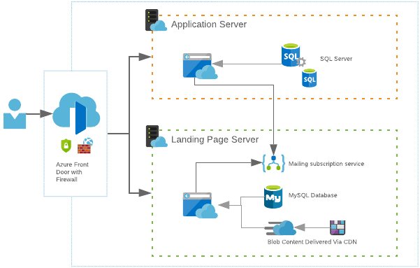
- the front-end which acts as a landing page and provides additional contextual web content, including background on the statistical methods, data, interpretation, a list of frequently asked questions, and other resources; and
- the application itself comprising the maps and other visualisations.
These two sections run on completely different servers but are grouped together under the one domain. Splitting the atlas into two sections allows us tp individually scale one or the other when the demand is required. This saves money on unused server resources.
Using a single-entry point to our network allows us to keep everything under the one domain name and set rules that direct a user to the correct server. E.g. any URL that starts with /app will go to the application server and anything else will go to the landing page.
At idle or low load, each server will sit at one instance or scale unit each. As more traffic arrives, more resources are required to keep up with the demand.
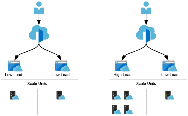
As people eventually launch the application, those resources are then required on the other server which we can then scale up, and simultanesouly scale down the landing page server as it’s no longer needed.
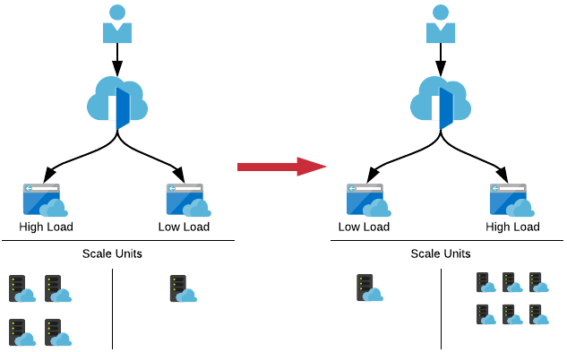
Having this dynamic scaling allows for unexpected spikes in traffic ensuring that the cancer atlas is always available.
One unexpected problem that was encountered was that although we prepared each server to account for scaling and demands, we didn’t anticipate the load on the gateway that directs the user to the correct server. As an analogy, it was like having a straw flow onto two drain pipes. When the gateway was stressed, it fell over and traffic had no idea where to go. We had to change the approach to how we handled this component of the network. We switched the gateway to a newer service that had only just been released that simplified the setup and scaled automatically. We were able to switch the two gateways over with minimal disruption of the service and the apps did not require any maintenance to account for the change.
The full application setup is summarised by the following image.
2.3.5 Communication and Translation
A key focus of the communication strategy for the Atlas was to ensure that the information within the Atlas was interpreted correctly at multiple levels from the public to researchers to clinicians to policy makers. This included the various focus groups and workshops mentioned previously, working with media representatives within Cancer Council Queensland, Cancer Council Australia and Queensland University of Technology to develop a messaging and communication strategy. Within this strategy was the provision of advice about how to mitigate the risk of alarm from the community and the likelihood of generating a rash of ‘cancer cluster’ concerns.
A number of steps were put in place to help ensure the Atlas launch had as wide a reach as possible. First, representatives from key organisations across Australia were invited to a workshop in Brisbane several months prior to the launch to demonstrate a beta version and gain feedback. Data custodians were provided with links to the final version of the Atlas two weeks prior to the launch, and there were separate briefings with key media people, along with preparing radio spots and social media blasts.
The effectiveness of this planning was demonstrated in that following the launch on 25th September 2018 there were more than 500 separate media items, including front page newspaper coverage, television news coverage, and other radio, online and newspaper reporting. There have also been more than 39,000 distinct users who have accessed the Atlas in the six months following the launch.
Ultimately, the success of this project will be measured by how widely the Australian Cancer Atlas is used by key stakeholders to guide and inform their decision making. Since its launch last year, the results from the Atlas have already been utilised in several other projects. For example, the modelled estimates for liver cancer have been used in the National Viral Hepatitis Mapping Report published in 2019 by the Doherty Institute for Infection and Immunity. There is also a formal collaboration with the New Zealand Ministry of Health to develop a New Zealand Cancer Atlas. This included running a short course in the development of the Atlas and application of the spatial models. The Australian Cancer Atlas has recently been formally included in the course content for a University of Melbourne “Master of Cancer Sciences programme”. It is also providing the foundation for the work within the CRE in Prostate Cancer Survivorship to better understand the geographical patterns in prostate cancer outcomes.
2.3.6 Further Development
It is important to note that the release of the Atlas was Phase 1, forming the basis for an ongoing program of development and research. Current plans for expansion include developing the Atlas to assess how geographical patterns change over time, and including other indicators such as cancer screening and other diagnosis tests, and surgical and other cancer treatment procedures.
We will also start to look at why this variation exists, by considering in more detail the characteristics of people living within areas, the clinical characteristics and treatment accessed, and using ecological modelling to identify key area-level factors that may be associated with the geographical patterns such as area disadvantage, remoteness, and access to services. In particular, we are looking at data options to include cancer screening participation rates, incidence of surgical and other treatment methods, location of cancer-related health services, socio-economic characteristics, and prevalence of risk factors and other diseases.
Central to these goals will be to enhance existing collaborations and develop new partnerships with national and international organisations involved with mapping cancer related and other disease outcomes. There will also be development and application of novel visualisation, statistical and geospatial methodology required to deal with often complex data and non-precise geographical details, including developing methods to deal with non-exact concordances between different geographical classifications.
One example of the potential for novel visualisations is the work currently being done at Monash University, looking at developing cartogram mapping, where each geographical area is shown as an identical sized hexagon. By giving each area the same visual weight, it removes the problem of standard maps where very large, but low populated areas have unduly high visual prominence.