Chapter 12 Interpretation and Communication of ACA Outputs
One objective of the ACA was to provide motivation to better understand the reasons for the geographical patterns in cancer incidence and survival that we observe for specific cancers. By incorporating information about what we currently know about the risk factors for specific cancers, along with how they are distributed geographically, we can obtain a better understanding of where the information gaps are.
Using four cancer types as examples, this chapter demonstrate how results from the ACA help achieve this goal and the type of interpretation we can gain from these type of data.
12.1 Examples of Interpretation
12.1.1 Liver Cancer
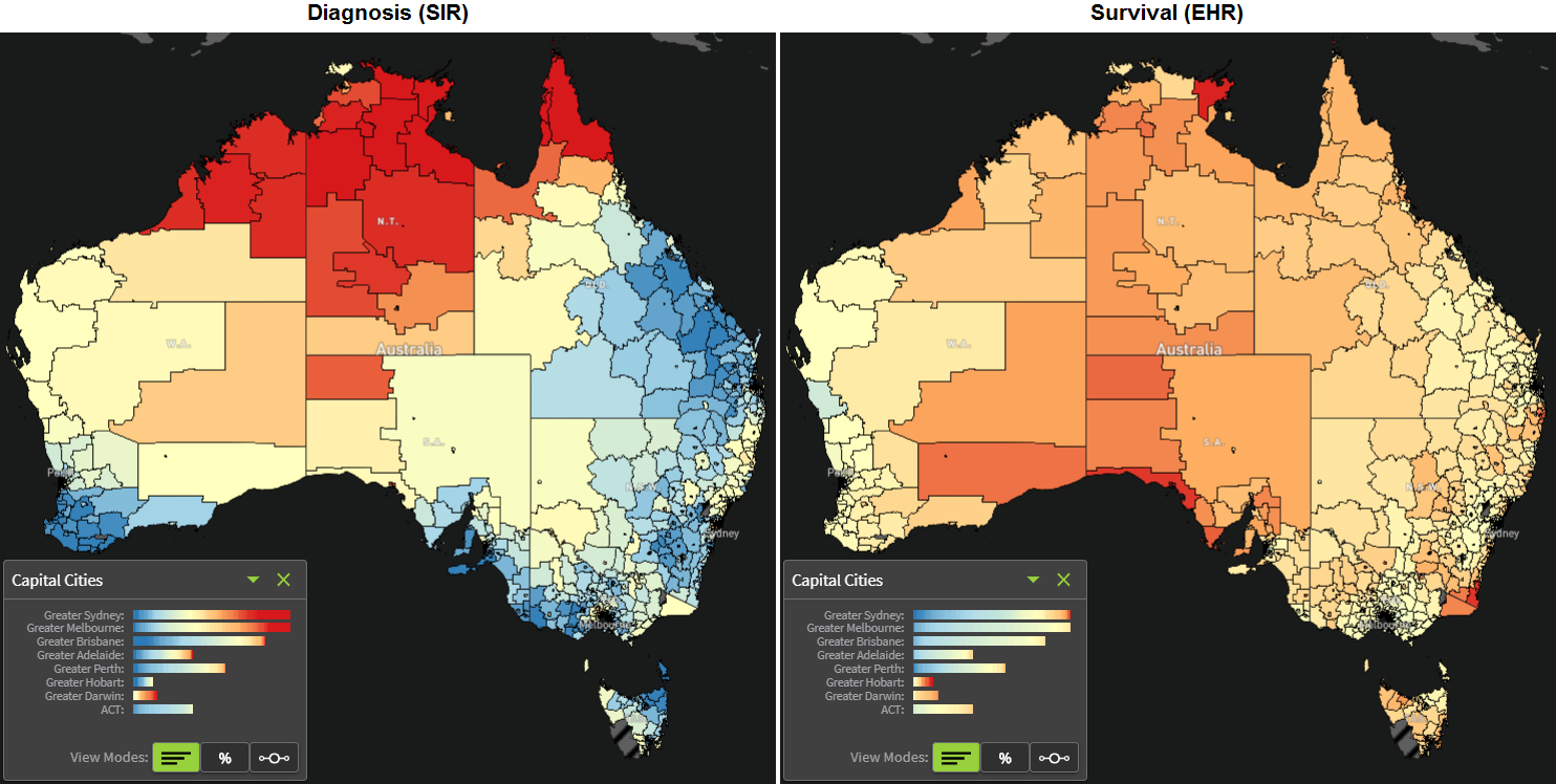
From a national perspective, the geographical patterns for liver cancer diagnoses are dominated by the higher rates in the Northern Territory and far northern areas of Western Australia and Queensland. In contrast, many areas in central and southern Queensland, regional New South Wales and southern parts of Australia have diagnosis rates that are lower than the Australian average.
However, it is important to consider the areas located within capital cities, which are not visible in the national map, but can be seen in the capital cities pop-up box. These show that Sydney and Melbourne have a substantial number of small geographical areas that have a much higher diagnosis rate of liver cancer than the Australian average. To a lesser extent Adelaide, Darwin and Brisbane also have some areas with higher than average diagnosis rates.
- Out of 433 SA2s within the greater Sydney region, about half (48%) had diagnosis rates of liver cancer that were substantially higher than the Australian average.
- It is a similar story in Melbourne, with nearly 40% of areas having a higher than average diagnosis rate of liver cancer.
- Perth shows a contrasting picture, with less than 10% of areas having higher than average diagnosis rates.
The biggest known cause of liver cancer in Australia is hepatitis B or C viruses that result in long term chronic liver infection. Most people with hepatitis B virus in Australia were either Indigenous Australians, or were born overseas in countries where the virus is relatively common, such as the Asia Pacific region or sub-Saharan Africa. Meanwhile, injecting drug users make up over half of the people with chronic hepatitis C virus in Australia. Other factors that can increase the risk of being diagnosed with liver cancer, include tobacco smoking, type 2 diabetes, high alcohol consumption, and obesity. So how do these known causes help explain the observed patterns in diagnosis rates?
Most of the SA2s in Northern and Central Australia have a high proportion of Indigenous Australians. Unfortunately, Indigenous Australians also are more likely to have some of the main risk factors for liver cancer just mentioned. So, this population distribution, combined with the prevalence of risk factors, probably explains at least some of the observed diagnosis patterns in northern Australia.
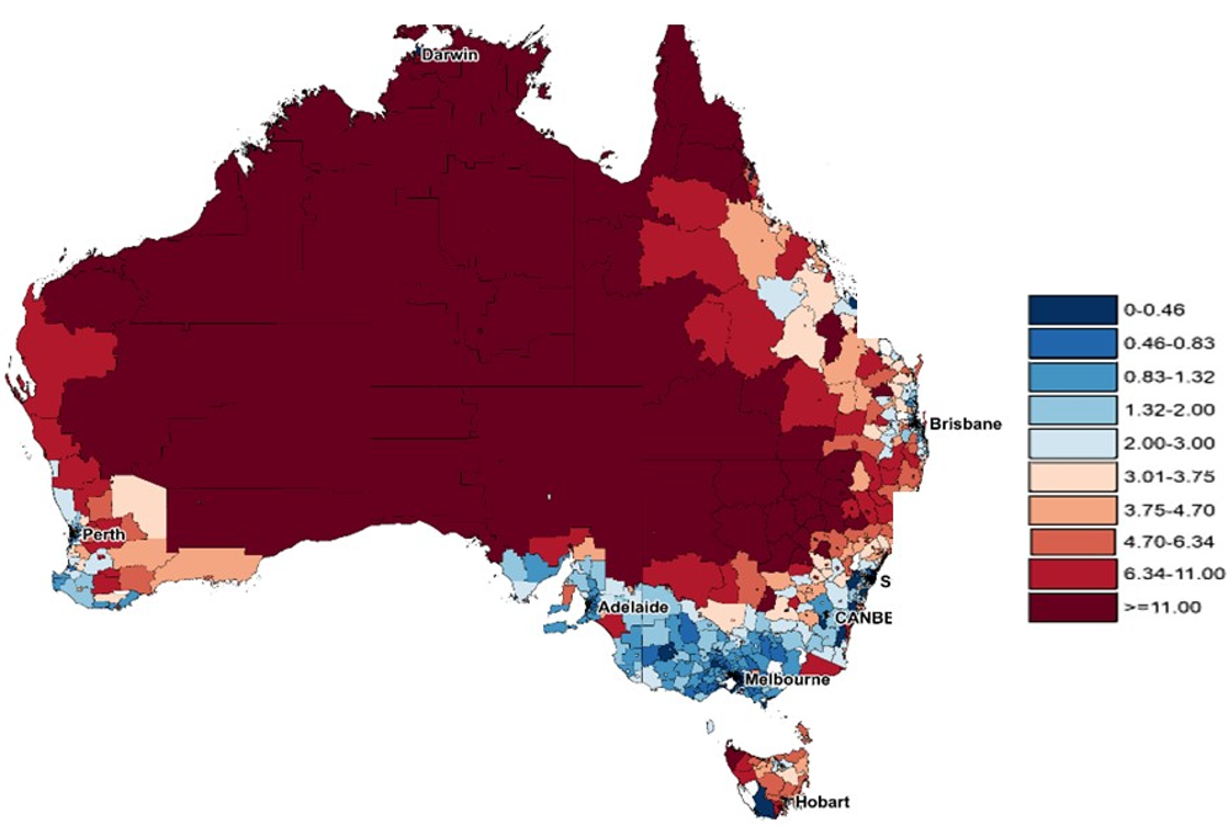
Source: Estimates of Aboriginal and Torres Strait Islander Australians, June 2011, 3238.0.55.001. Australian Bureau of Statistics.
However, there is very little relationship between liver cancer diagnosis rates and Indigenous populations in the cities of Brisbane Melbourne and Sydney.
Geographical patterns of hepatitis B and C infection are currently only available by the broad Public Health Network geographical regions. Despite this, they demonstrate the very high prevalence rates for hepatitis B and C in the northern territory and in metropolitan Melbourne and Sydney, consistent with the liver cancer diagnosis patterns. The geographical link between the prevalence of Hepatitis C is less obvious. So while there is some consistency between the geographical patterns in these risk factors with the diagnostic patterns, there are clearly other as yet unknown factors involved.
When considering excess deaths, not only are people in northern Australia more likely to be diagnosed with liver cancer than the Australian average, they are also more likely to die from the disease within five years of diagnosis. However, when looking at the survival in capital cities, a very different picture emerges, and one that is different from the diagnostic patterns.
Although residents of many areas of Sydney had a higher risk of being diagnosed with liver cancer, they also have a much lower average risk of dying from the liver cancer within five years of diagnosis. A similar pattern is evident in Melbourne and Perth.
Consistent with this is the strong pattern that the excess deaths due to liver cancer is higher than the Australian average in many regional and remote areas of the country, and lower than the Australian average in many major city areas. The causes of these survival patterns are unclear.
Due to the complexity of diagnosing liver cancer, it’s likely that many cases go undiagnosed. As well as impacting on the liver diagnosis patterns, it will also impact on the observed estimates of excess deaths. For example, if only the worst cases of liver cancer are diagnosed, then the survival outcomes are likely to appear to be very poor. If, however, cases of liver cancer are diagnosed early, then this will increase the diagnostic rate, and the survival rate. It is possible that health professionals in areas with high proportions of migrant populations, or high proportions of injecting drug users, have increased awareness of the disease, and this may lead to earlier intervention, earlier diagnosis and then opportunity for more effective treatment.
12.1.2 Lung Cancer
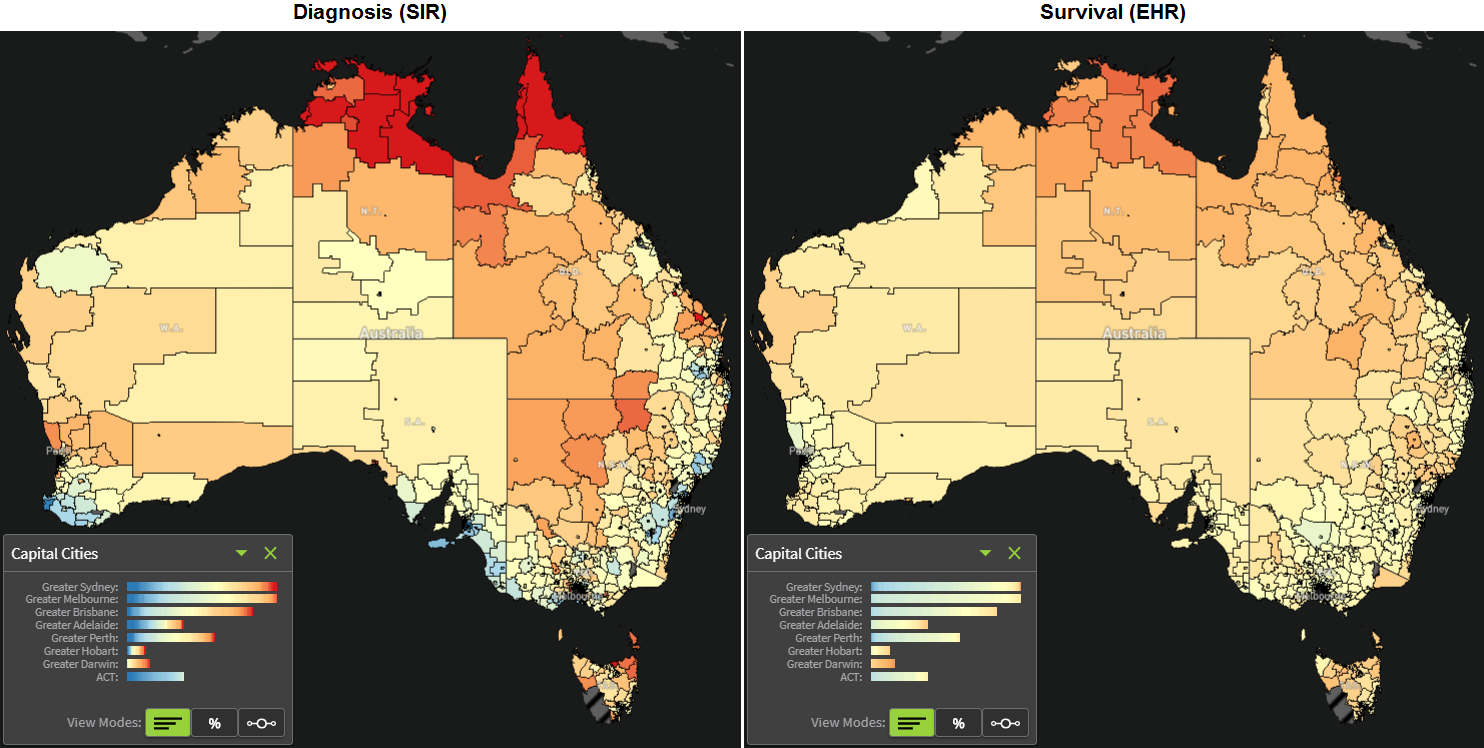
When we consider lung cancer diagnoses, the Australian map shows a fairly scattered picture. The majority of areas in the inner, western and northern parts of Australia, along with Tasmania, had lung cancer diagnosis rates that were higher than the Australian average. In contrast, many of the areas on the coastal regions of eastern and southern Australia had lung cancer diagnosis rates that were lower than the Australian average.
There was also a clear association between lung cancer diagnosis rates and area-level socioeconomic status, with more areas in disadvantaged regions having higher than average lung cancer diagnosis rates, and conversely for affluent areas. There is a similar type of association with remoteness, with more areas in regional and remote parts of Australia having higher than average lung cancer diagnosis rates.
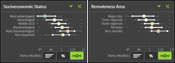
The percentage of Australians who smoke is highest in the most disadvantaged areas and remote areas of the country. Given that around 80% of all lung cancers are caused by smoking tobacco, the consistency between the geographical patterns of lung cancer, and those of smoking, is to be expected.
However, there is a substantial time lag between starting smoking and a lung cancer diagnosis. This means that smoking patterns are usually reflected in lung cancer diagnosis patterns 20-30 years later. Therefore it is likely that the current smoking patterns by geographical area were similar to that 20 years ago, and also suggests that the geographical disparities for lung cancer are likely to continue for the next two or three decades.
When looking at the variation in excess deaths due to lung cancer, we see a consistency in patterns, even though the extent of variation is a bit less. This means that not only do people living in areas in which the average risk of being diagnosed with lung cancer is higher than the Australian average, but when diagnosed, they also experience a higher risk of dying from their lung cancer within five years.
12.1.3 Melanoma
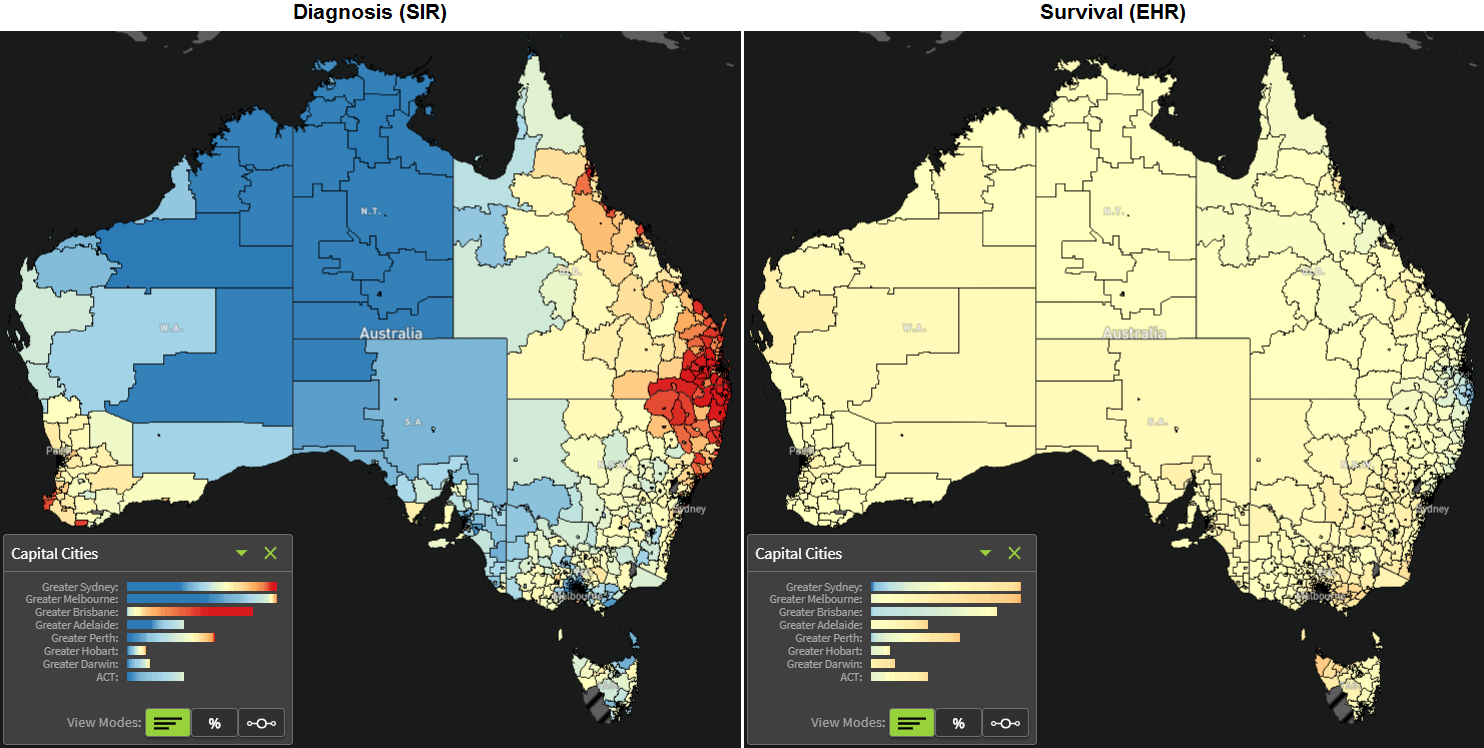
When looking at the diagnosis patterns of melanoma, there is a high concentration of areas in south-east Queensland and northern New South Wales with a higher than average diagnosis risk, as well as some coastal areas of northern Queensland and the south of Western Australia. In contrast, the diagnosis rate in most areas in central, north western and southern Australia is substantially lower than the Australian average.
In contrast, the geographical patterns for excess death due to melanoma are more muted. Of note, though, are the areas with higher than average excess deaths in the south of Australia, particularly around Melbourne and Tasmania. There is also a concentration of areas with lower excess deaths, shown in blue, around south east Queensland and northern New South Wales.
Unfortunately, we do not, as yet, have definitive answers as to what is driving these patterns. We can make some suggestions, but need more evidence to confirm or refute these.
- Queensland and northern New South Wales are renowned for their outdoor lifestyle leading to relatively high sun exposure. While this increases the risk of melanoma, similar to what was mentioned for liver cancer, it may also increase the ‘skin cancer awareness’ of the population in these regions, thus leading to a higher prevalence of whole body skin checks. Previous work has shown that whole body clinical skin examinations are associated with a higher number of thin melanomas being diagnosed. When coupled with the large number of skin cancer clinics in this region, this combination of factors may at least partly explain the higher diagnosis rate of melanoma in these regions.
- Conversely, a contributing factor to why most of the areas in Northern, Central and Western Australia have lower than average diagnosis rates might be the higher proportion of these populations who are Indigenous Australians, given their relatively low incidence of melanoma.
When combined with the diagnosis patterns, we see there are many areas showing a high diagnosis and low excess deaths, such as for south east Queensland, or the combination of lower diagnosis and higher excess deaths, such as in the areas around Melbourne.
Both these patterns are consistent with a screening or early detection effect, in which a greater prevalence of clinical skin examinations is associated with a higher incidence of thin melanomas, and lower incidence of thick melanomas, both of which would lead to lower observed excess deaths due to melanomas.
12.1.4 Prostate Cancer
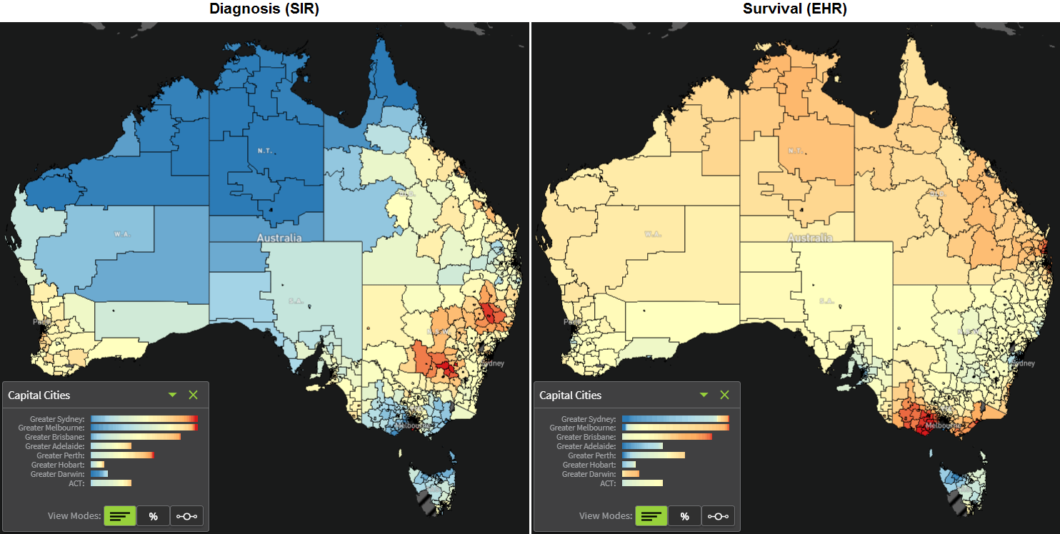
The map of prostate cancer diagnosis rates is dominated by the lower than average rates in many areas of western and northern Australia, as well as in Victoria and Tasmania. Most areas with higher than average prostate cancer diagnosis rates can be found in New South Wales, and to a lesser extent in the south west of Western Australia and Central Queensland.
While there are no known causes of prostate cancer, there are several factors suggested to increase the risk of a man being diagnosed with prostate cancer. The test most commonly used to aid early detection of prostate cancer is the prostate specific antigen (PSA) blood test. However, this is not a diagnostic test as it can only indicate changes in the prostate. While screening for prostate cancer through PSA testing has led to a reduction in advanced disease at diagnosis, it can and does also lead to the diagnosis of some very early and extremely slow growing prostate cancers that may not have caused symptoms had they been left untreated. Geographical areas with a higher proportion of men who have a PSA test are likely to also have a higher diagnosis rate of these prostate cancers. Given these cancers have very high survival, these areas are also likely to have lower excess deaths due to prostate cancer.
The map for excess deaths due to prostate cancer is dominated by the higher than average rates across most of central, western and northern Australia, and particularly high rates in many areas of Victoria.
As we saw for melanoma, for many, although not all, areas, the patterns for excess deaths due to prostate cancer are in the opposite direction to that for prostate cancer diagnoses, suggestive of a screening or early detection effect. For example, many areas in central New South Wales have higher than average prostate cancer diagnosis rates but lower than average excess deaths due to prostate cancer. In contrast, many areas in Victoria have lower than average prostate cancer diagnosis rates but higher than average excess deaths due to prostate cancer. The same can be observed for central and northern areas of the country.
However, this early detection effect is not always visible. For example areas around Adelaide have lower than average diagnosis rates of prostate cancer and lower than average excess deaths.
Until there is more detailed information about PSA testing at the small area level across Australia, information about stage at diagnosis, and any differences in management practices, it is not possible to know for sure what is driving these geographical patterns.
12.1.5 Conclusions
This leads us to the key gaps in information. It is likely that most of these geographical patterns are determined by some combination of lifestyle behaviours and genetics of the population living in the area, early detection and screening activities, and, for excess deaths, clinical characteristics of the cancer along with treatment and other management practices. Unfortunately, data on these variables at the small area level are limited.
To this end, it is hoped that the ACA provides motivation to initiate mechanisms to collect the required data, or extract the information from existing datasets, a precedent for data custodians in regard to privacy and confidentiality concerns, and motivation and opportunity to collaborate between research groups
12.2 Communicating Information from the Atlas
Given that a key objective of the Atlas was to ensure that the Atlas informed and motivated action, we started considering what the key messages were about six months out from the launch. The issues we discussed during this process was reminding ourselves about the key audiences, outlining the key messages, thinking through the best strategies to disseminate the information, and anticipating the type of questions that users of the atlas may have.
We have already discussed the target groups (Section 2.2.3), consisting of:
- general public,
- policy users,
- scientific researchers, and
- health practitioners.
12.2.1 Key Messages
When we worked through the key messages, we wanted to keep them consistent with, and build on, the current cancer council messages, increasing our ability to use this as an advocacy tool. We needed to ensure that the terminology we used, and the messages, were media friendly. So we included people from a media and communication teams in this process.
There were four key messages that we wanted to disseminate:
- Cancer incidence and survival varies significantly across Australia. The Atlas will be used to inform policy making, resource allocation, and underpin advocacy efforts to reduce these geographical inequities and therefore save lives.
- While some geographical disparities and population variations are influenced by the characteristics of people who live in the area, and access to screening and healthcare, many causes of cancer remain unknown.
- Investing in research that helps us further understand the reason for geographical disparities will enable health organisations and all levels of Government to develop targeted strategies and programs that reduce the burden of cancer in Australian.
- The Atlas will help raise awareness of lifestyle factors that can significantly influence these rates, including quitting smoking, reducing alcohol intake, eating a healthy diet, exercising regularly and being SunSmart.
12.2.2 Communication Strategies
About nine months before the launch of the Atlas, in December 2017, an initial newsletter was sent to identified stakeholders in research, government, data custodians, clinicians patient groups and members of the community. The aim of the first newsletter was to introduce the Atlas and outline its goals and purpose. Recipients were then asked to subscribe to receive future newsletters. Subsequent newsletters and other updates about the launch were sent to those people who had subscribed.
Each newsletter focused on a different theme:
- general introduction to the Atlas,
- outline of the purpose and benefits of spatial smoothing, and
- overview of the visualisation methods.
In addition to raising awareness about the planned Atlas, these newsletters forced the research team to think through how best to describe some of the technical concepts such as statistical smoothing. Although there were benefits in producing these newsletters, and there were plans to disseminate additional newsletters leading up to the launch, the production of the newsletters was very time consuming and so after the third newsletter it was decided to focus all efforts on completing the Atlas itself prior to the launch.
The main focus of the dissemination strategy revolved around the public launch. Two weeks before the launch we provided data custodians with a password protected URL to view the atlas and prepare relevant briefings for their directors and/or health ministers. We also ensured that key stakeholders knew about the timing of the launch, and briefed key media people in newspapers, television and prepared radio spots.
The formal launch was held at QUT, with crews from five television stations covering the event. We also had social media blasts through Facebook, Twitter and LinkedIn, as well as sharing details about the atlas through personal and professional networks of the collaborating organisations.
This planning was effective, in that there were more than 500 separate media items, including front paper newspaper coverage, television news coverage, and other radio, online and newspaper reporting. There were also more than 30,000 distinct users who accessed the atlas during that first week of the launch.
The final communication strategy was to try and pre-empt some of the questions that might be asked of users. These questions were developed during a pre-launch stakeholder workshop that was held in May this year, in which the attendees were asked to provide open ended questions they had about the alpha version of the atlas. These questions were then collated, with similar questions combined into one. Responses to these questions were then drafted by the investigators and reviewed by the media and web content team, and members of the Project Advisory Group.
The questions were grouped into the following categories:
- general questions about the use of the Atlas,
- information that relates to individuals and their risk,
- technical questions,
- questions about specific cancers, and
- other questions.
The most relevant and important issue relating to the second point above is cancer clusters. There is often a lot of misconception about what cancer clusters are, and it is important to realise that there are many explanations for an area having a higher risk of cancer than the Australian average. The most likely explanation is that it relates to the specific characteristics of people living within the area, and the prevalence of known risk factors. It is also important to note that true cancer clusters are very rare, and typically related to asbestos. If a cluster is still suspected, it needs to be investigated by a formal process, mainly by government health authorities.