Data Smoothing
What is it and how is it used in the Australian Cancer Atlas?


The Australian Cancer Atlas displays cancer statistics as ‘modelled’ or ‘smoothed’ estimates. Which simply means that it smooths out random variations in cancer rates so we can see a clearer pattern in the results. This visual explainer describes what data smoothing is, and how it is used in the Australian Cancer Atlas.
What is data smoothing?


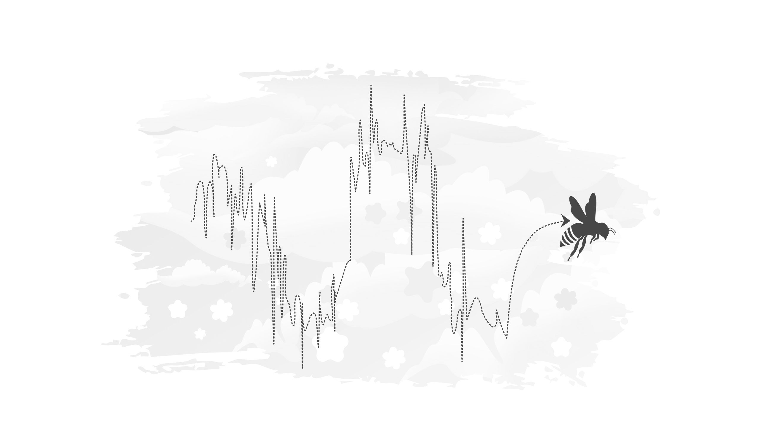


The concept of data smoothing can be explained through an example of a bee flying between lots of flowers.
Imagine a bee's zig-zag flight as it moves from flower to flower. If we were to plot the bee's path, it could look chaotic with sharp turns and sudden changes in direction.
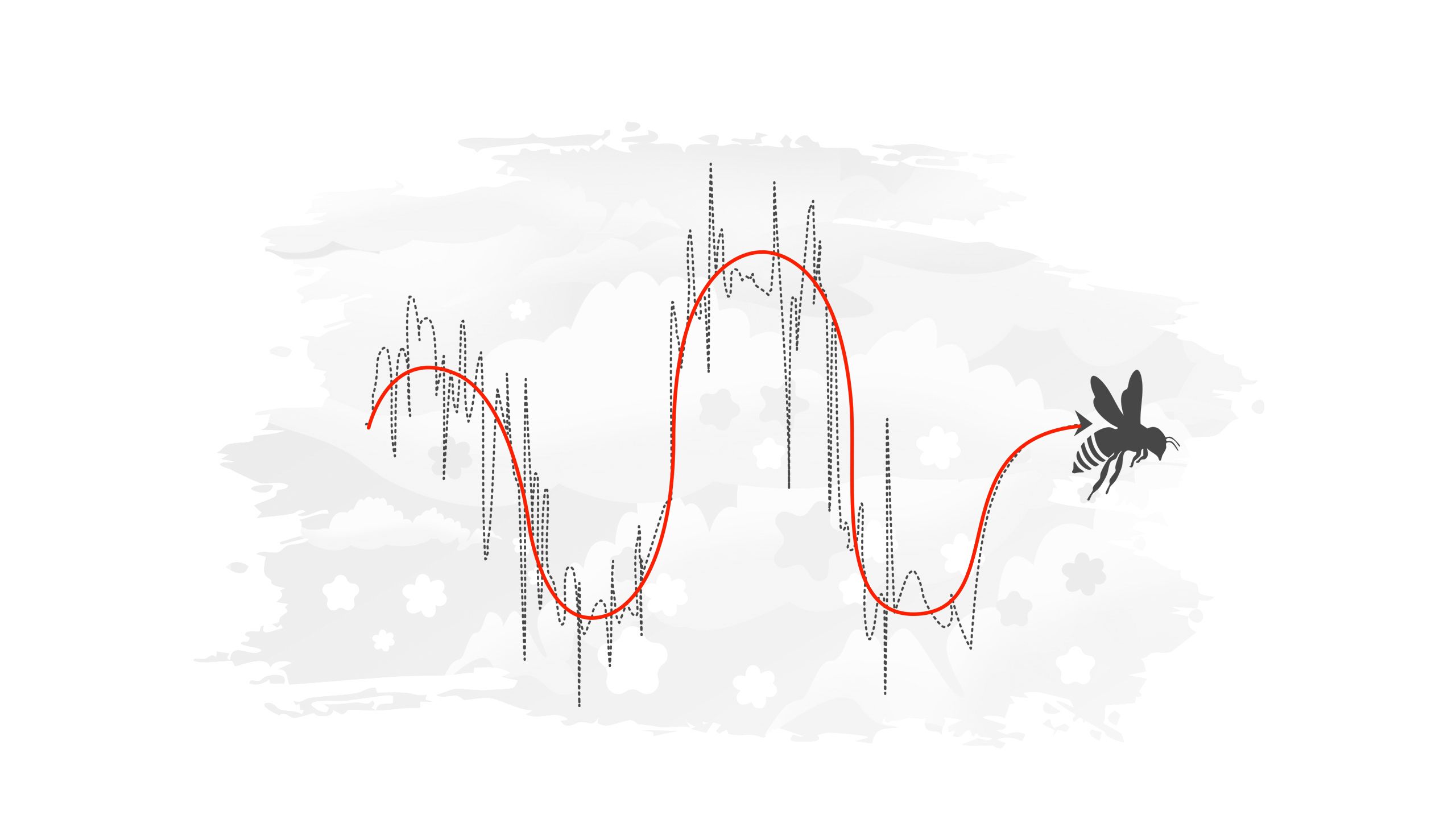
By applying data smoothing, we can create a clearer, less chaotic representation (red line) of the bee's flight. This smoothed path shows a "smoother”, more continuous curve. The smoothed curve removes the sharp turns and sudden changes in direction, making it easier to see the bee’s overall pattern of movement.
Data smoothing helps us to see the bigger picture by filtering out small fluctuations and focusing on the overall pattern of a phenomenon. Data smoothing has the added benefit of obscuring random fluctuations so that the privacy of the raw data is ensured.
Why is data smoothing used in the Australian Cancer Atlas?


Smoothing of cancer data in the Atlas is applied to geographical areas. Within any given area, observed rates of cancer burden (such as diagnosis and survival) or influencing factors (such as screening and testing, risk factors, and hospital treatments) may fluctuate due to random variation. These random fluctuations can obscure our view of the real underlying cancer variations and therefore need to be minimised in order to understand the overall change in cancer rates. That is the reason that estimates of diagnosis and survival rates (including all other indicators) are smoothed in the Atlas.
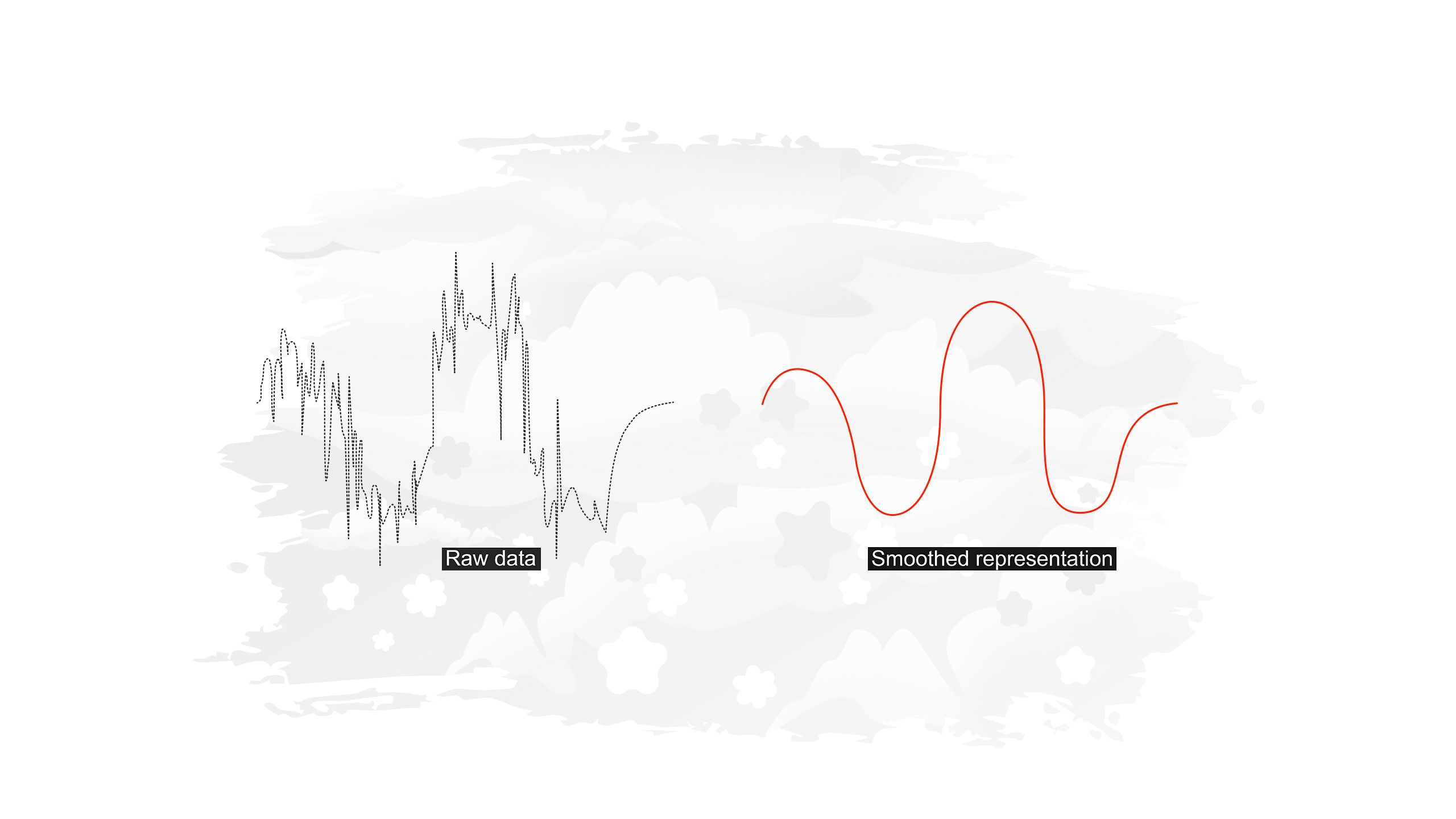
To better understand why smoothing is applied to cancer data in the Atlas, let's take a look at a hypothetical example of cancer diagnosis, and apply the same basic concept of smoothing described in the bee example.


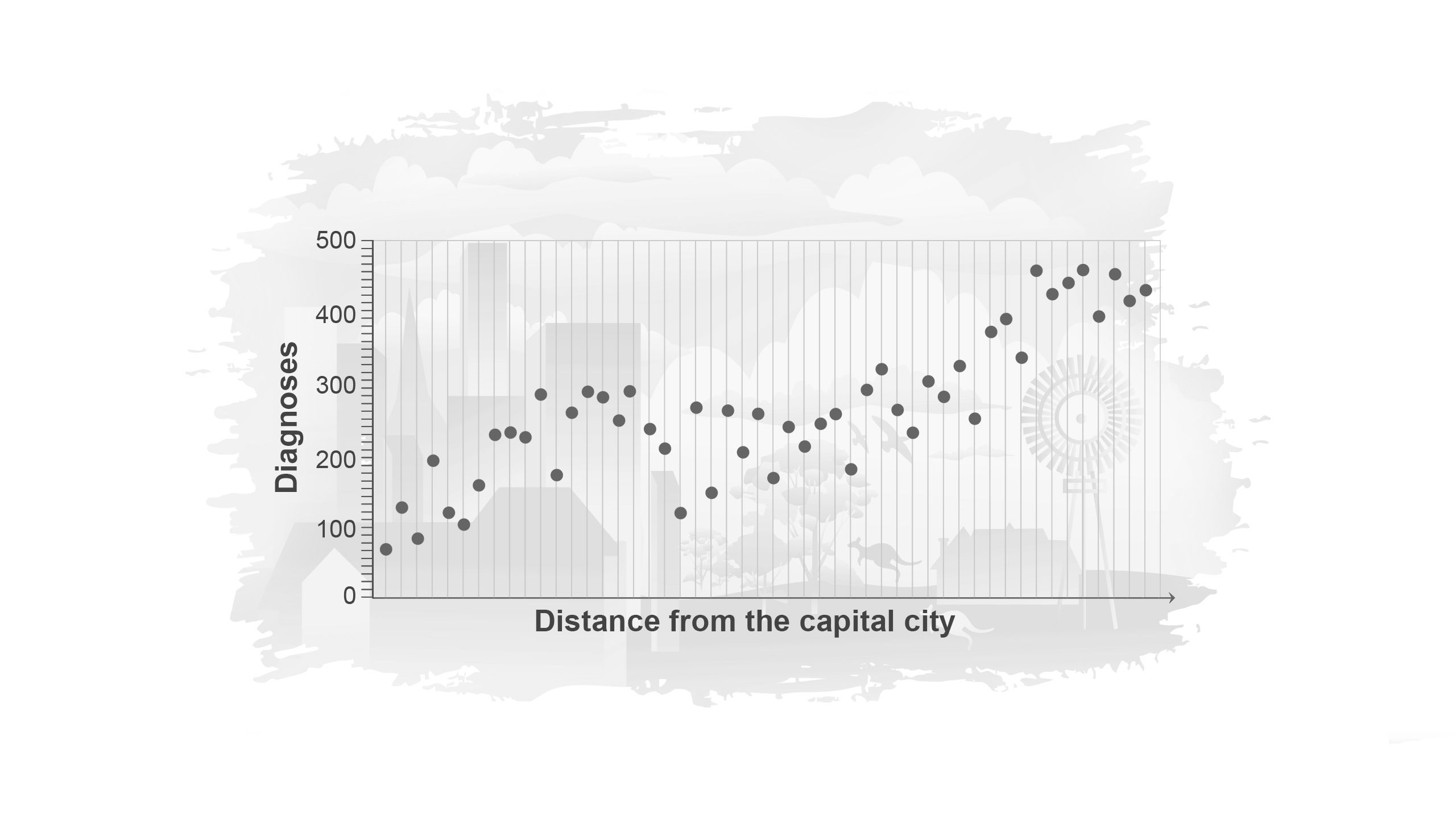

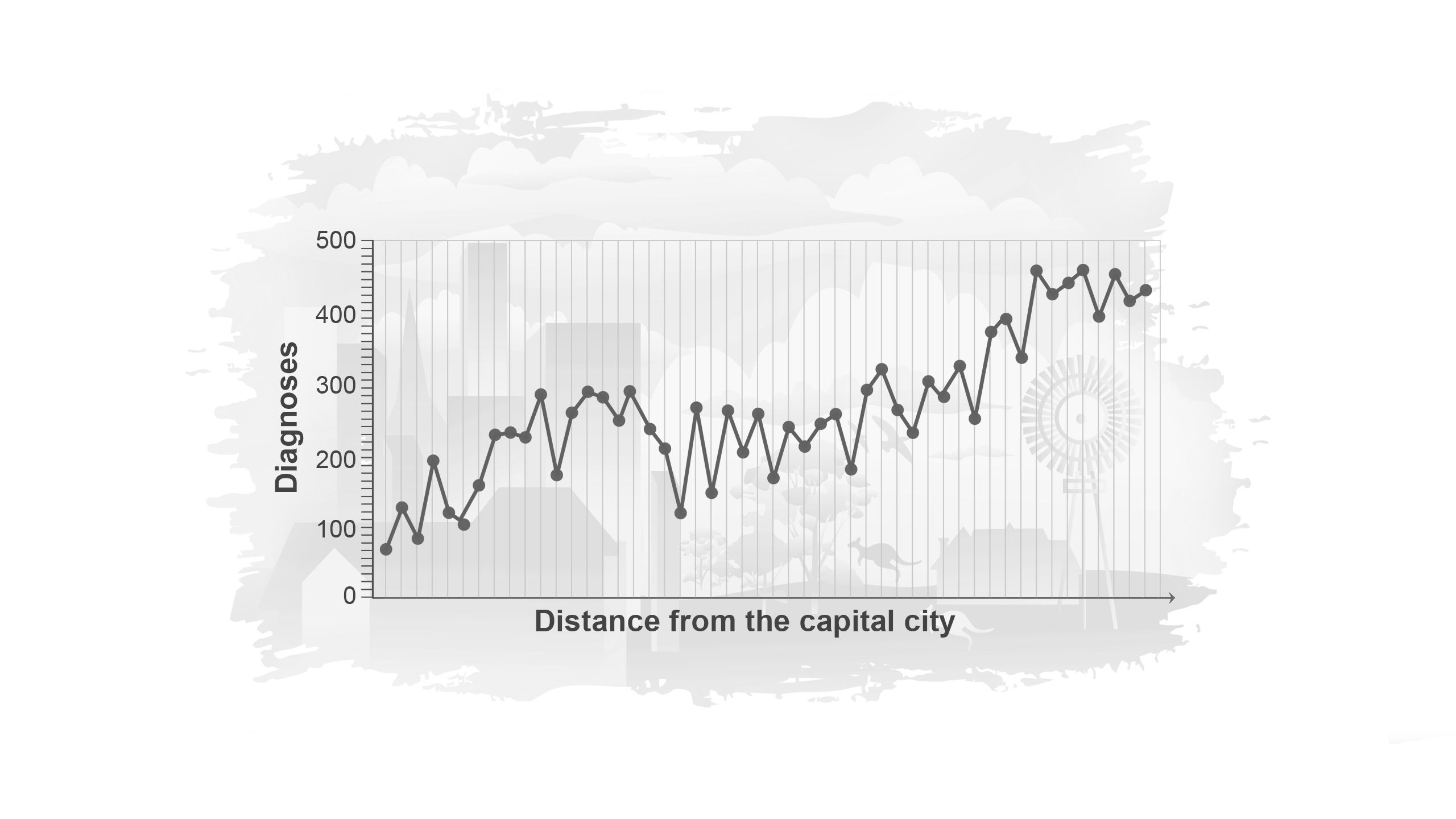

Suppose we count the number of new cancer diagnoses in 50 suburbs surrounding a city, each with a total population of 500. These are plotted in order of distance from the city centre from left to right. The number of people diagnosed with cancer are represented by the dots.
The number of cancer diagnoses seems to go up and down randomly from suburb to suburb, making the pattern hard to see.
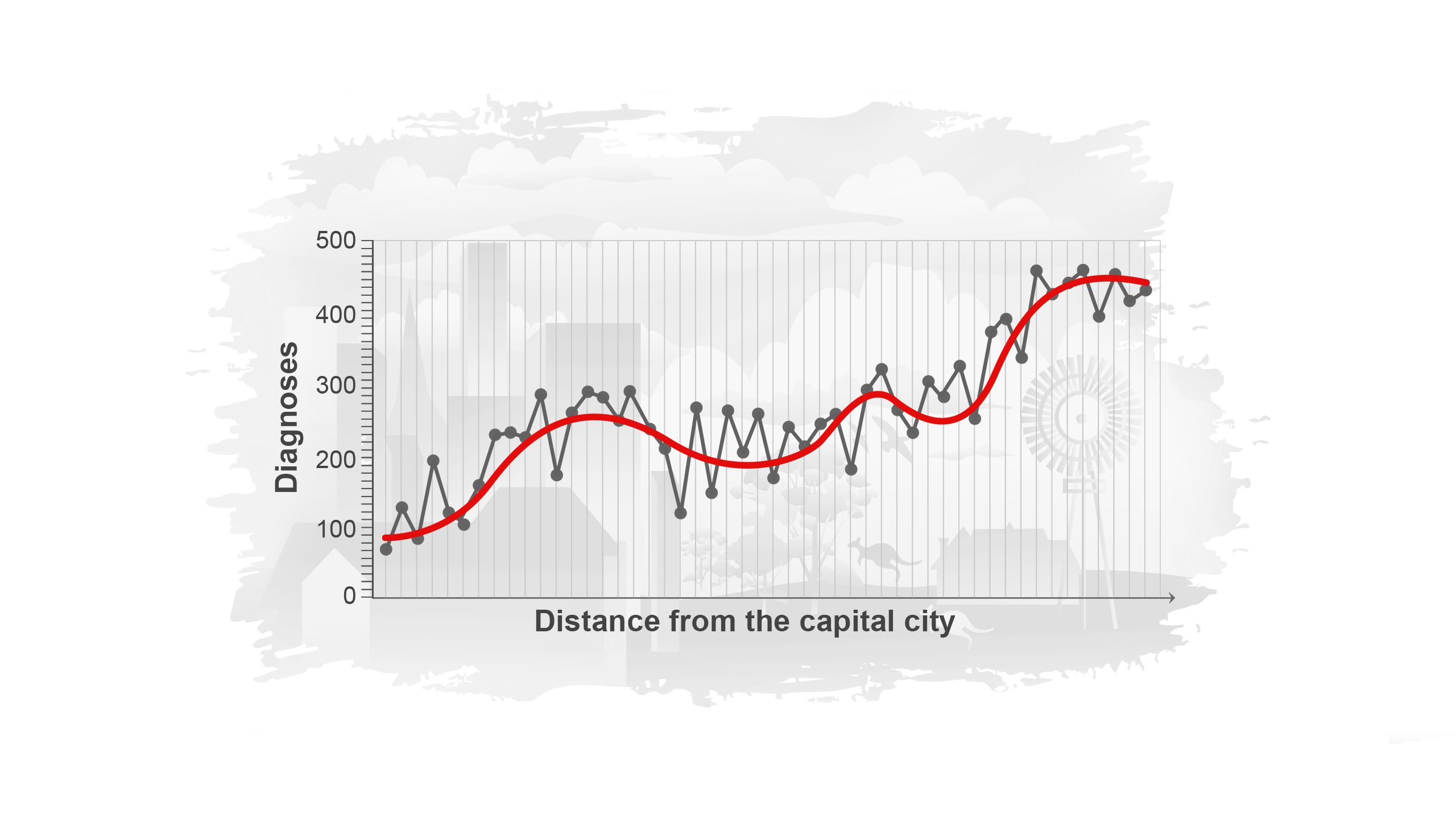
When we smooth the data, shown by the red line, we get a much clearer understanding of how cancer diagnosis varies with increasing distance from the capital city.
Reporting the smoothed estimates rather than the observed data allows the Australian Cancer Atlas to:
- focus on the underlying geographic patterns of cancer diagnosis and survival rather than random fluctuations
- protect the privacy of individuals' health data
Statistical tests based on small samples tend to be more variable, prone to random fluctuations, making them less reliable. This is also true for data from small geographical areas. If we reported only the raw or observed data for each area, the maps would be dominated by these fluctuations. Instead, we aim to highlight patterns in the data. This also has the important benefit of protecting the confidentiality of each individual reflected in the data.
What does data smoothing look like in the Australian Cancer Atlas?


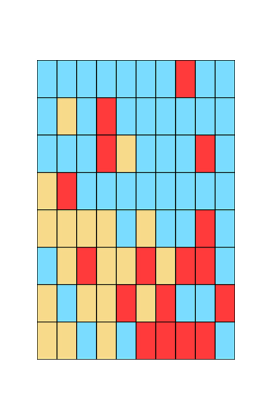
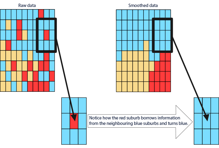
The way the smoothed data are visualised in the Atlas reflects the geographic patterns underlying the data and how each area compares to the national average. In another hypothetical example, each of the rectangles in the figure on the right represents a small geographical area. The observed diagnosis rates for each area are represented by the colours blue, yellow or red. Areas in blue indicate that diagnosis rates are lower than the Australian average in these areas. Areas in yellow have diagnosis rates equal to the Australian average, while red areas' diagnosis rates are higher than the Australian average. As you can see, the image is busy, making it difficult to discern a clear pattern.
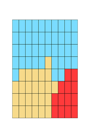
By calculating and visualising smoothed estimates, a clearer pattern of cancer diagnosis rates across the different areas is produced. In the Australian Cancer Atlas, these types of smoothed estimates are used to visualise the geographical patterns.

Wait... how were the original data converted to smoothed estimates?
While there are many statistical methods for smoothing data, how did we decide on a specific approach?


As shown in the figure below, the flight path of the bee can be smoothed to varying degrees, from very minimal smoothing (red line 1) to merely a straight line (red line 4).

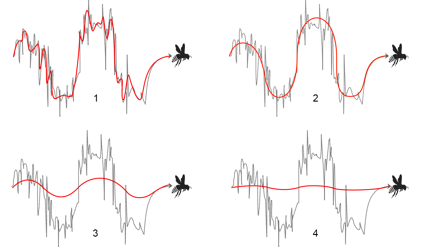
The top-left example is considered too close to the raw data as it retains much of the random variation of the raw data and therefore does not make the data any easier to interpret. The examples in the bottom row have too much smoothing and we begin to lose information about the bee’s true flight path. To ensure the smoothed results are balanced, meaningful and useful, the Atlas team identified a statistical approach that provided the right balance between showing too much variability (with minimal smoothing) and showing too little variability (with excessive smoothing). In the approach used in the Atlas, information is borrowed from neighbouring geographical areas to increase the amount of data available to generate reliable statistics. The logic behind this is that populations in nearby areas tend to have similar characteristics, such as lifestyles, although this may not always be the case in practice. To account for this, the statistical approach pulls estimates for each area toward the overall average, which, in the case of the Australian Cancer Atlas, was the Australian average.

Among other factors, the amount of smoothing that occurs in an area depends on the size of its population. Statistics in areas with larger populations are less influenced by those in neighbouring areas. Conversely, in areas with smaller populations, the smoothing process has a greater effect, which includes pulling estimates closer to the overall (Australian) average.
What role does data smoothing play in reducing uncertainty in estimates?


All statistical estimates have some degree of uncertainty. The more uncertainty there is, the less confident we are in the estimate. Statistics from areas with smaller populations tend to have more uncertainty because there are less data to base the statistic on, making it less precise and less reliable. Smoothing helps reduce uncertainty because it borrows information from neighbouring areas and from the national average, particularly in those situations where the population is small and estimates are less reliable. Let’s explore further this advantage of smoothing in reducing uncertainty with the help of an image:

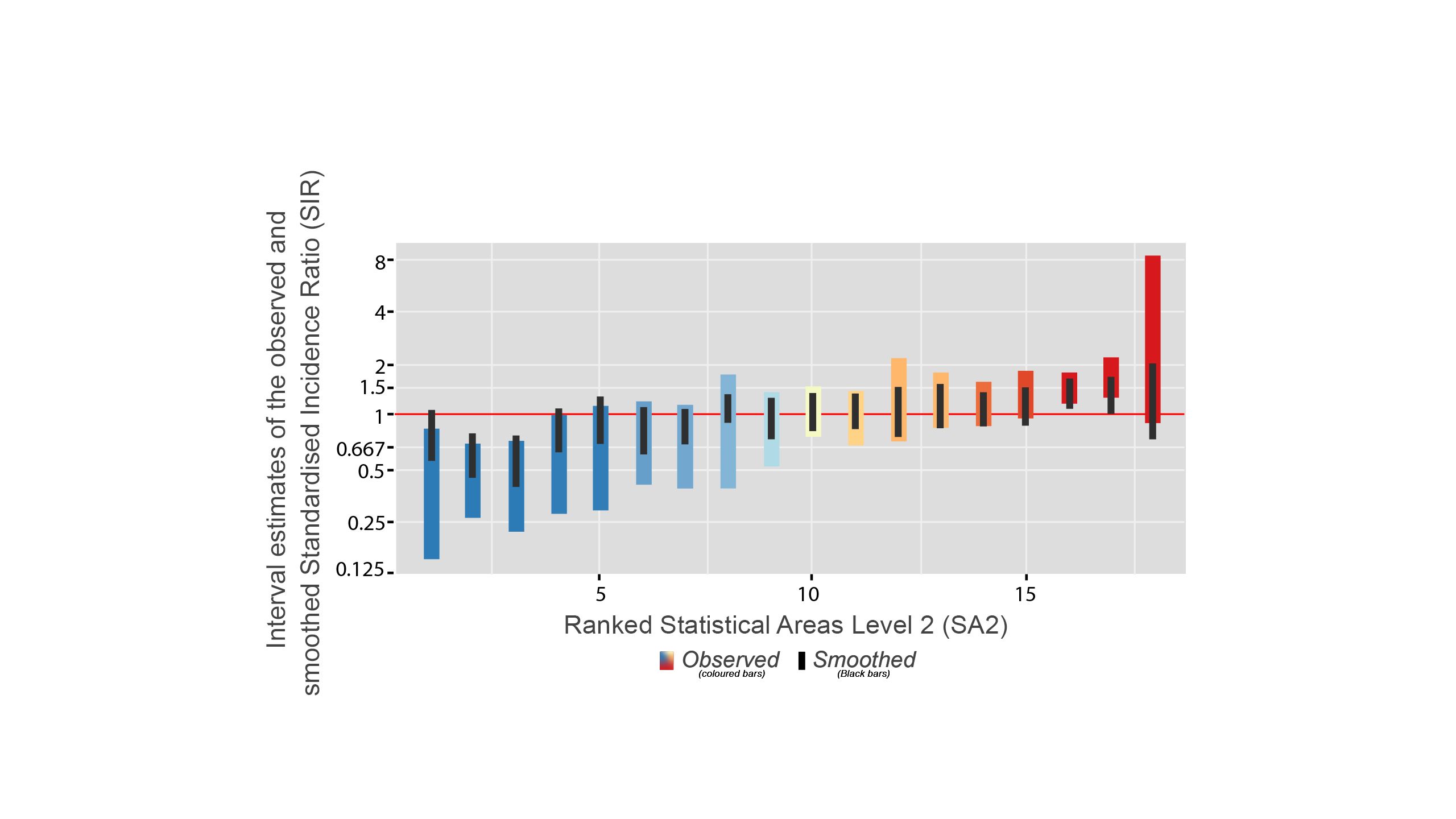

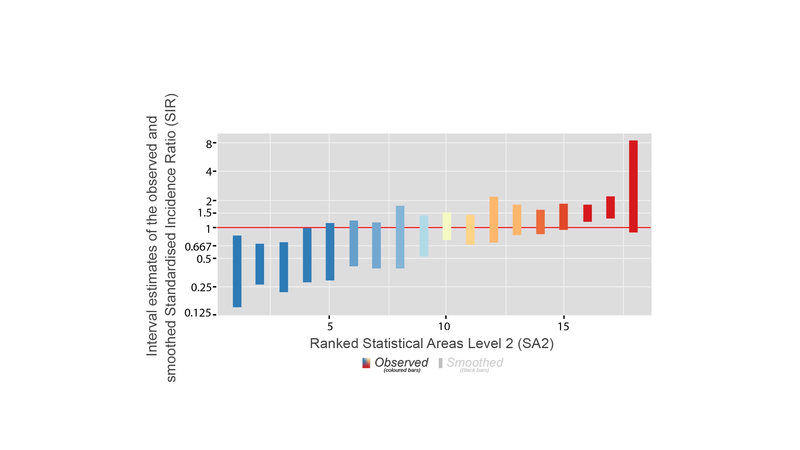

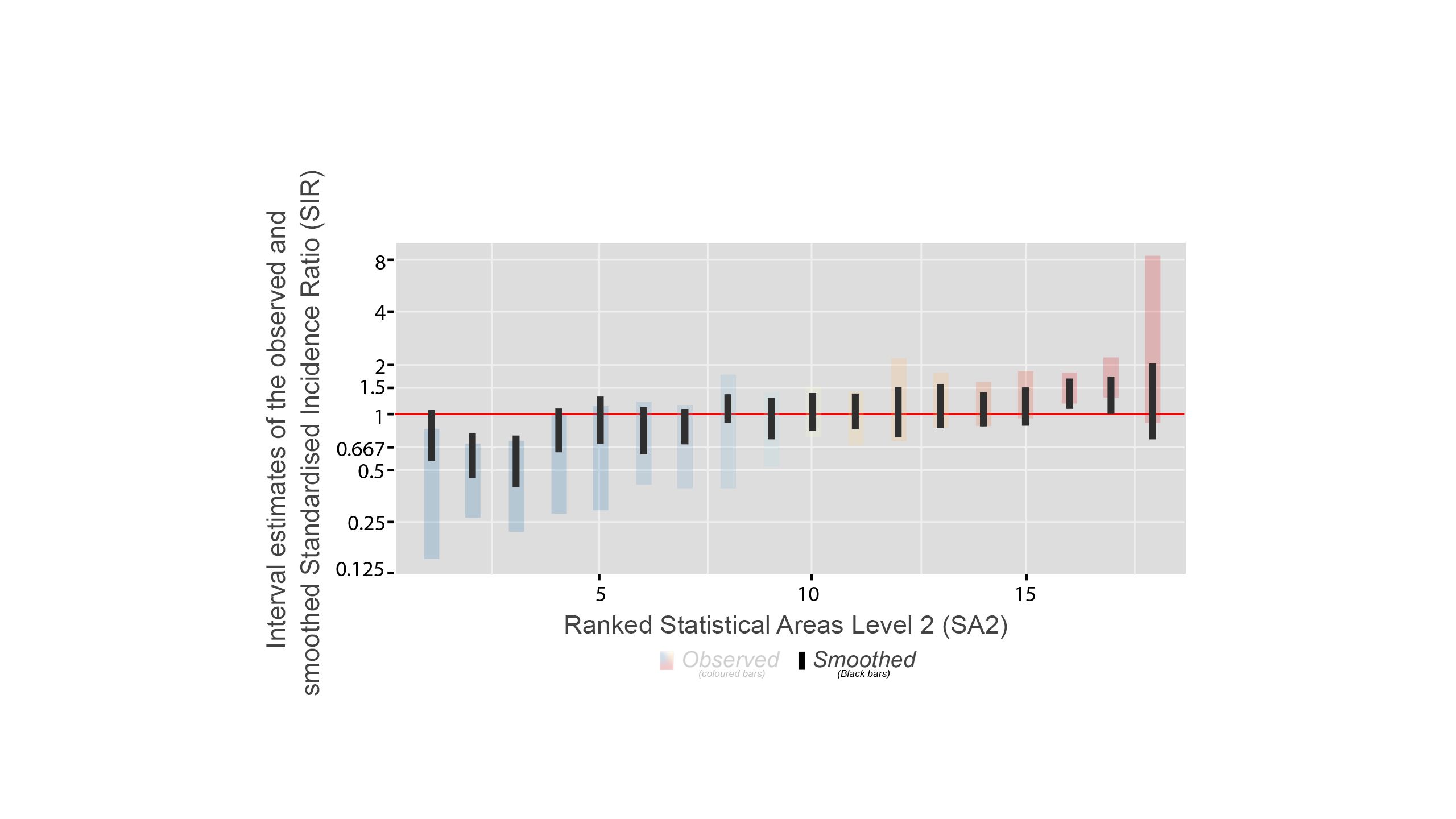

In this figure, the red horizontal line shows the Australian average. There are two types of bars: coloured vertical bars and the black bars inside.
Coloured Vertical Bars
The coloured bars show the range of uncertainty for the original statistics - the Standardised Incidence Ratio (SIR) estimates. The true value of the statistic is likely to be somewhere within this range.
Shorter bars indicate less uncertainty and are usually from areas with larger populations.
Longer Bars indicate more uncertainty and are usually from areas with smaller populations.
Black Bars
These black bars represent the uncertainty for the smoothed statistics.
The advantage of data smoothing
The effect of smoothing is greatest when it is needed the most (such as in areas with smaller populations).
* The black bars are generally shorter than the coloured bars, meaning the smoothed estimates have less uncertainty.
* The contrast between the two types of bars is greater when the observed SIR has large uncertainty.
* For most areas, the statistic has moved closer to the overall average.
The benefits of data smoothing


1. Reducing random variation from data: Results using raw, original data represent the observed values without any modifications, while smoothing helps reveal the underlying patterns by reducing the impact of random variation.
2. Data privacy: By removing the unnecessary details, data smoothing also hides the personal identifiers of the people whose cancer diagnosis and survival has been recorded and ensures data privacy. Privacy of all data relating to people diagnosed with cancer is of utmost importance and data smoothing ensures this privacy is maintained in the Australian Cancer Atlas. This is especially important for areas with small numbers of observations (for example, small numbers of diagnoses). Smoothing protects data privacy by borrowing additional information from neighbouring areas.
3. Handling missing data: Data smoothing can help to accommodate missing or incomplete data by estimating values based on surrounding data points. This can provide a more complete and more accurate picture of any underlying patterns.
If you would like to learn more about data smoothing:

Creators of this visual explainer
Dr. Muhammad Haroon, Postdoctoral Fellow Communication Specialist, Cancer Council Queensland.
Project administration, Visualisation, Writing - original draft
Jacinta Lisec, Research Associate, School of Teacher Education and Leadership, Queensland University of Technology.
Writing - original draft
Associate Professor Kate Thompson, Lead Digital Learning for Change, Queensland University of Technology.
Methodology, Supervision, Writing - review & editing and Funding acquisition
Professor Peter Baade, Research Lead Cancer Epidemiology, Cancer Council Queensland.
Methodology, Supervision, Writing-review & editing, and Funding acquisition
Distinguished Professor Kerrie Mengersen, Director Centre for Data Science, Queensland University of Technology
Methodology, Funding acquisition
Contributors
Associate Professor Helen Thompson. Associate Professor of Statistics, School of Mathematical Sciences, Queensland University of Technology, Conceptualisation
Associate Professor Suzanna Cramb. Principal Research Fellow, Australian Centre for Health Services Innovation, Queensland University of Technology
Conceptualisation
Dr. Jessica Cameron, Senior Research Fellow, Modelling and Epidemiology, Cancer Council Queensland
Conceptualisation
