How to Use
Methodology, technology, data sources and visualisations
An overview of the methods used to create the Atlas is provided in Technical Report. If you’d like detailed information on the Australian Cancer Atlas 2.0 project, please see our Technical Report (e-book). Inside, you’ll find information about:
- An overview of the approach used to create the Atlas
- What geographical areas were used
- How population data were obtained
- An overview of the statistical methods used to generate the results
- Further details about cancer diagnosis, cancer survival, cancer risk factors, cancer screening and testing, and selected hospital treatments (prostate cancer only)
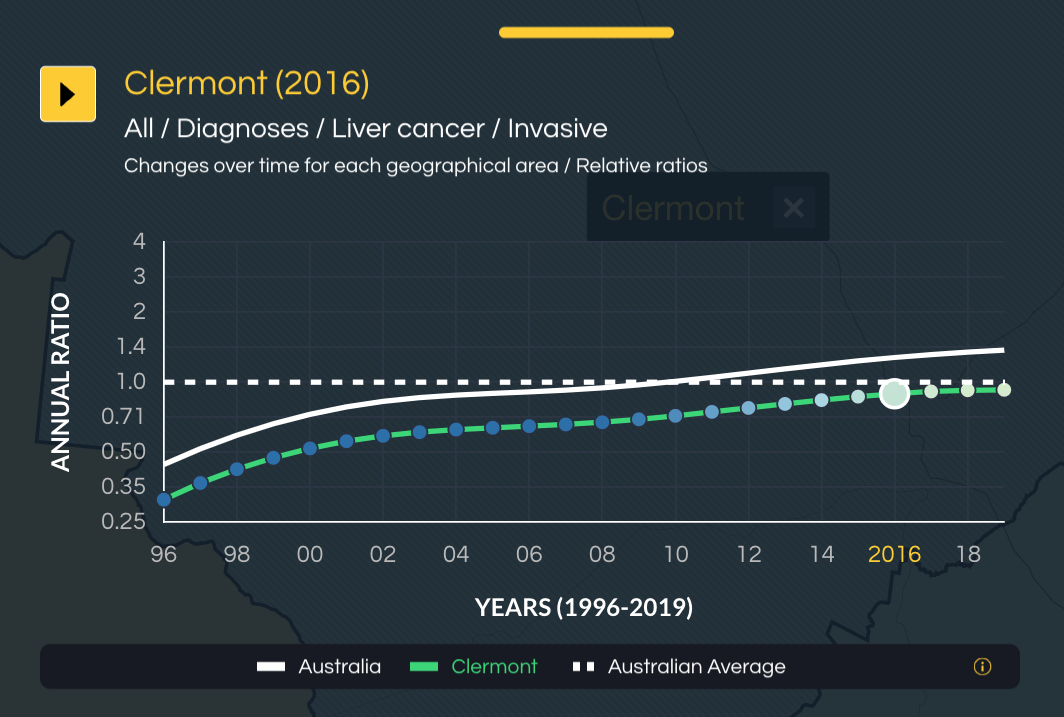
- Details about the visualisations included in the Atlas, including the various graphs and map layers
- Some of the limitations that need to be considered when interpreting the results

How to use the Australian Cancer Atlas 2.0

Basic navigation
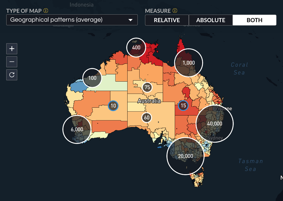
Use the boxes and pull-down menus at the top of the Atlas to choose what to view on the map:
- Enter suburb or post code to zoom into a specific area
- Choose which indicator to view – diagnosis, risk factors, survival, screening or testing and hospital treatment
- Choose the specific measure to view (this varies depending on the indicator selected)
- For some cancer types (melanoma, breast cancer and prostate cancer), you can select specific cancer characteristics for diagnosis and survival.
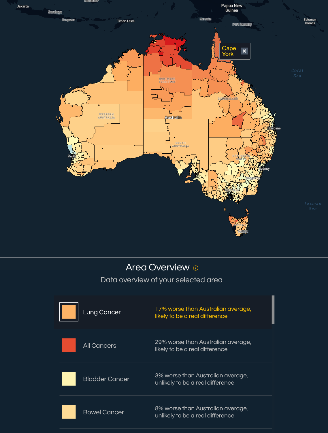
Once the desired combination of menus is selected, the corresponding statistics for Australia will be shown. This section will also tell you whether there is evidence of a real difference between an area’s cancer rates and the Australian average rate. The bottom panel will show you a regional overview of all cancers. The following cancer types are included in the Atlas, noting that some are only relevant for males and females separately.
All sexes
Bladder cancer, bowel cancer, brain cancer, classic myeloproliferative neoplasms, head and neck cancers, kidney cancer, leukemia, liver cancer, lung cancer, melanoma, mesothelioma, myeloma, neuroendocrine tumours, non-Hodgkin lymphoma, oseophageal cancer, oral cancers, pancreatic cancer, rare blood cancers, rare cancers, soft tissue sarcomas, stomach cancer and thyroid cancer.
Male-specific data
Prostate cancer and testicular cancer.
Female-specific data
Breast cancer, cervical cancer, ovarian cancer, uterine cancer, vulva cancer (while breast cancer can be diagnosed among males, the small number of cases were not sufficient to enable inclusion in the Atlas).
Advanced visualisations
You can expand the drop-down menu at the top right of the screen to either include or exclude specific area characteristics, including by:
- Socioeconomic index
- State/territories
- Greater capital city regions
- Remoteness
This menu also allows you to add layers to the visualisation, including:
- Location of all hospitals
- Location of Principal Referral Hospitals
- Location of public oncology services
- Geographical boundaries of the Primary Health Networks
- Geographical boundaries of the Local Government Areas

Step-by-step Guide
Click through each step to learn more about interacting with the Atlas interface.


